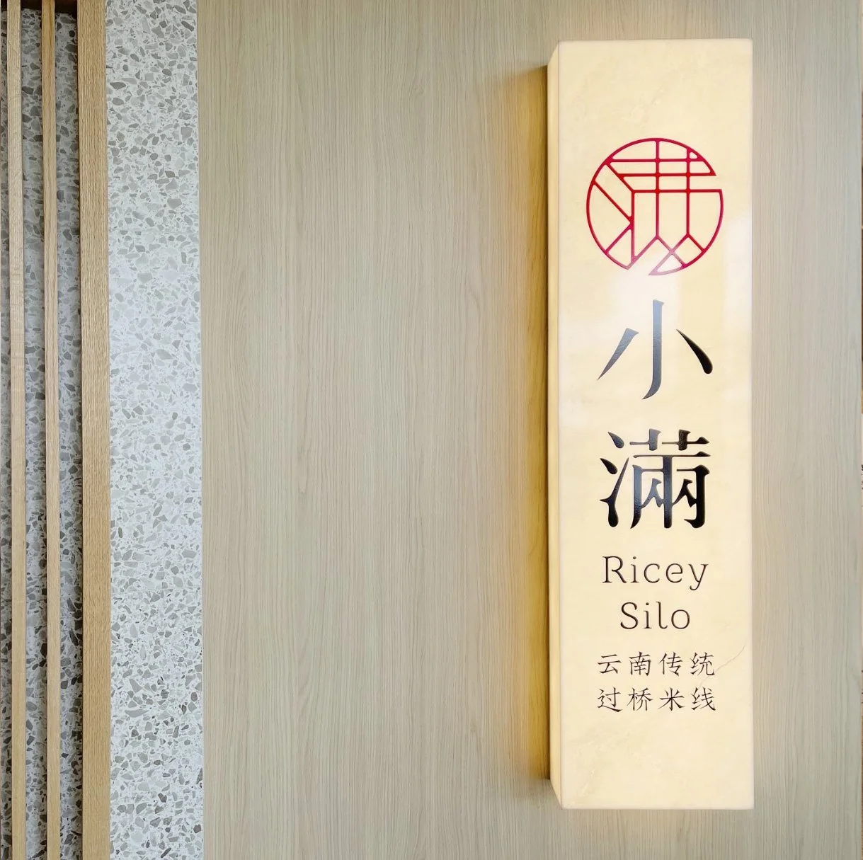
小满米线 Ricey Silo 全案设计
Comprehensive Branding


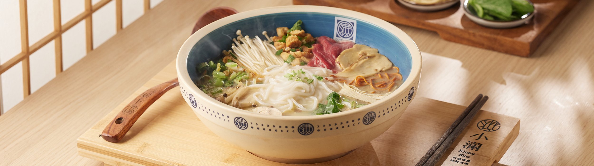
最优选的食材,最地道的过桥米线
Quality Ingredients, Authentic Yunnan Flavours
「小满」是一个节气的名字,是指谷物的麦穗渐渐饱满的过程。
「小满」也是一种人生状态,一种对未来充满信心,对成长充满希望的信念。
作为地道云南人的客户,力求把最地道的家乡美食带到加拿大。原汁原味,原汤化原食,拒绝使用任何科技添加剂。于是从项目伊始我们就知道,这是一个精益求精的客户在打造一个各方面都希望做到极致的品牌。
Xiao Man takes its name from a traditional Chinese solar term, symbolizing growth, abundance, and optimism for the future.
Rooted in Yunnan, China, the founders set out to bring authentic hometown flavours to Canada, with a focus on premium ingredients, traditional recipes, and natural cooking without artificial additives.
From the very beginning, it was clear that this was a brand built on passion, authenticity, and an uncompromising commitment to quality.
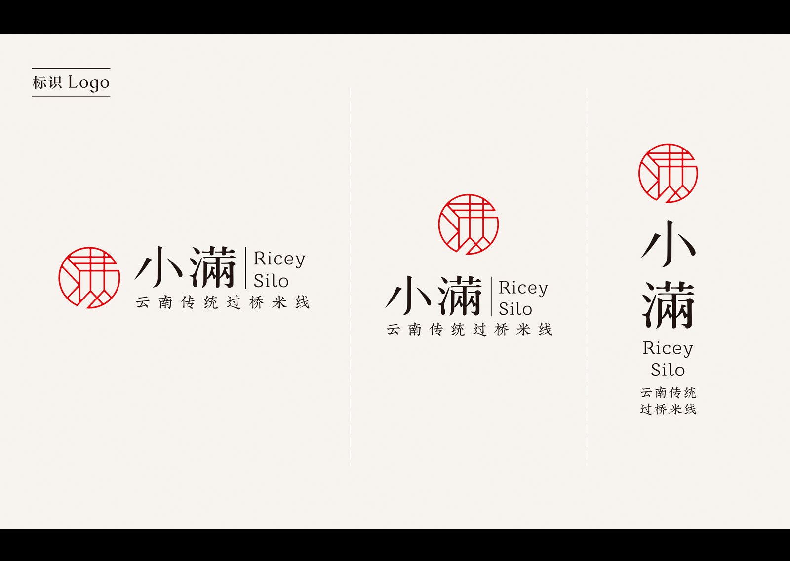
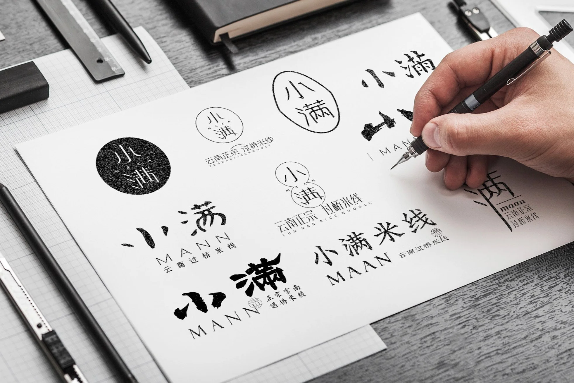
品牌规范-LOGO标准化-Brand Guideline
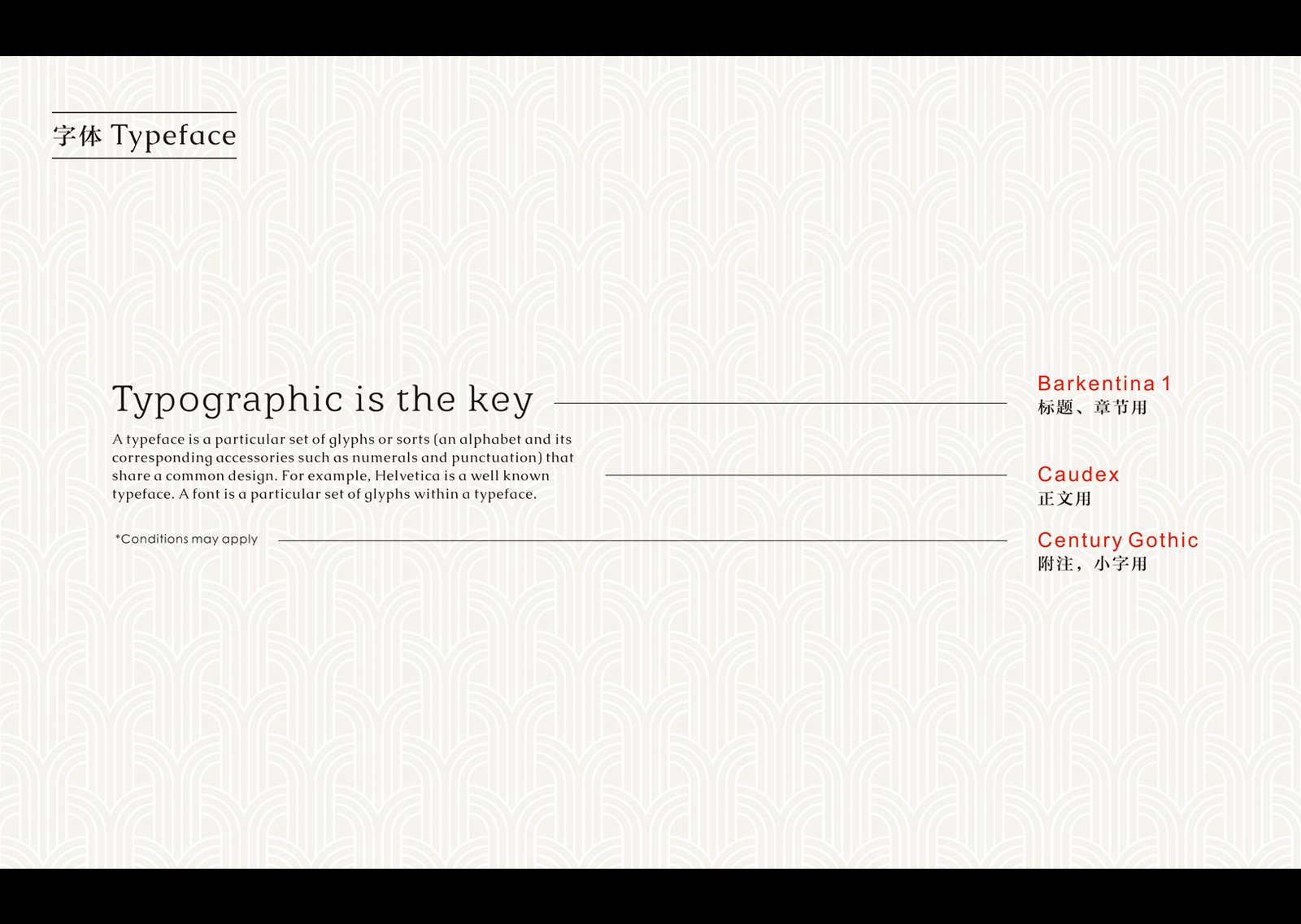
品牌规范-字体使用规范-Brand Guideline
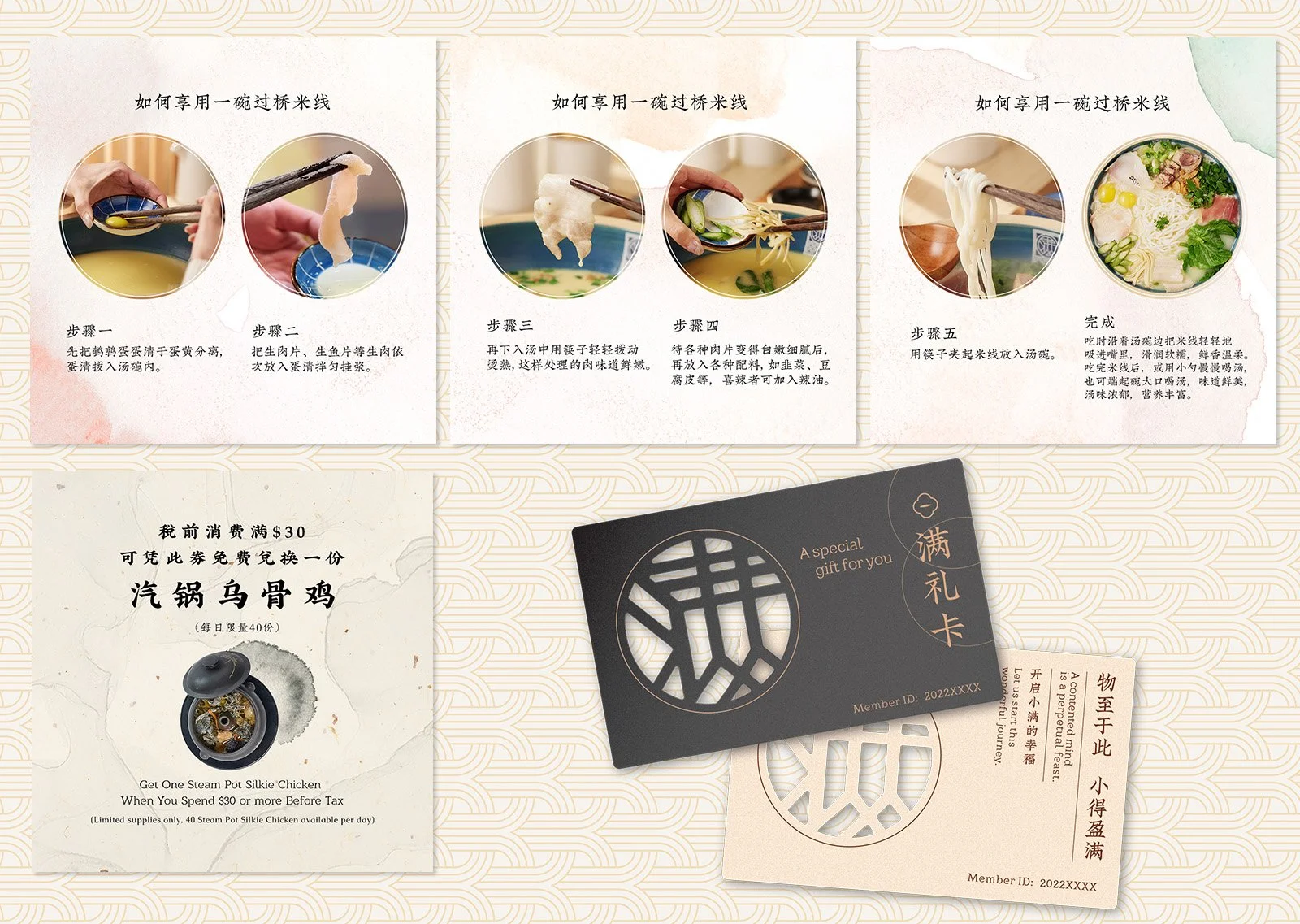
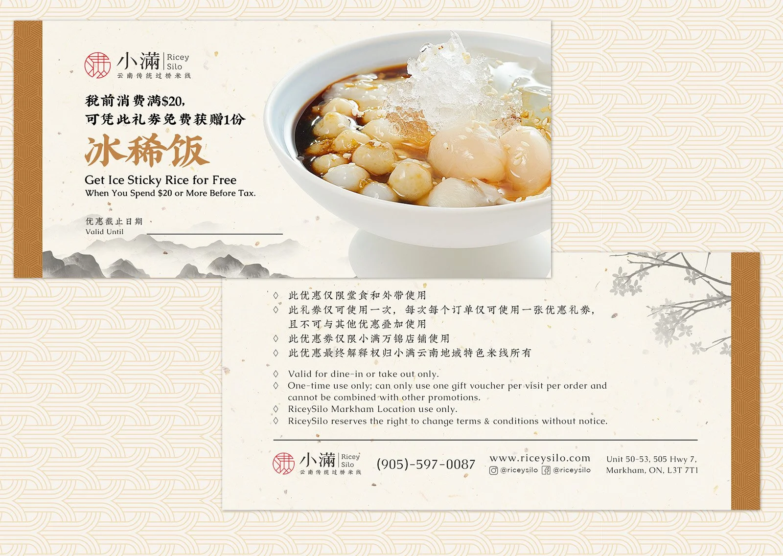
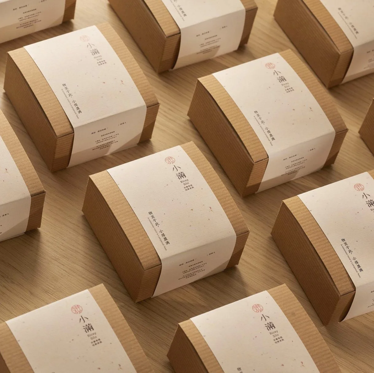
物料应用-Brand Guideline
物料应用-Brand Guideline
三年磨一剑
Three Years in the Making

客户在审美上有着极高的追求,这也对设计团队的基本功提出了非常高的要求。在创意和执行地过程中我们与客户一同不断推敲方案,打磨细节。
With a client who had exceptionally high design standards, every detail mattered. Throughout the creative process, we worked closely together to explore ideas, refine concepts, and perfect the execution, ensuring every element met our shared vision.
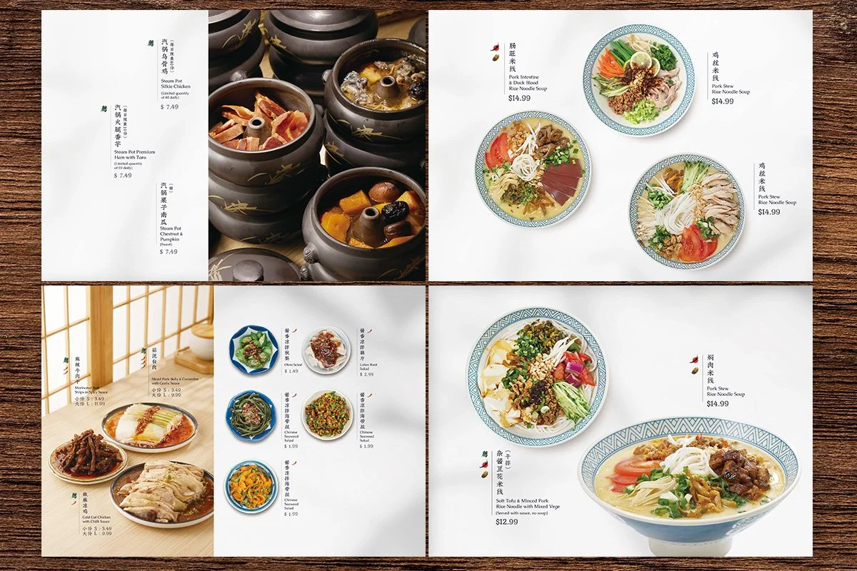
和谐,民俗,雅致,健康,我们提炼出了这些关键词,而这些词最终帮助我们确定了品牌的调性。整体风格是中式的简约主义,版式里大量的留白营造出干净,唯美的意境。配合柔和的配色,以及优美的宋体和楷体为字体,更凸显出古朴,优雅的气质。
Harmony, cultural heritage, elegance, and wellness became the key elements shaping the brand’s visual identity.
Inspired by Chinese minimalism, the design embraces generous white space, soft colours, and refined traditional Chinese typography. Together, these elements create a clean, timeless aesthetic that feels both authentic and contemporary.
传统不是一味的做旧
Tradition with a Modern Touch
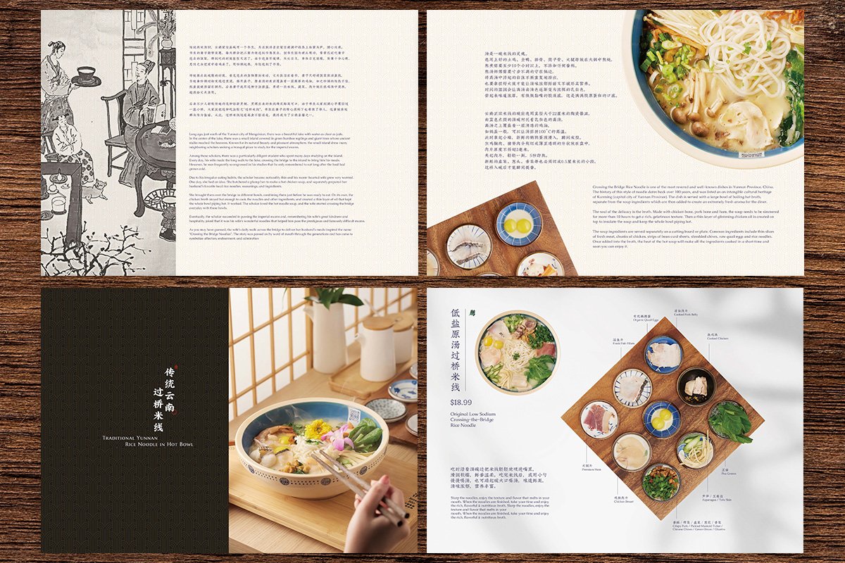
菜单设计-Menu Design


菜单设计-Menu Design

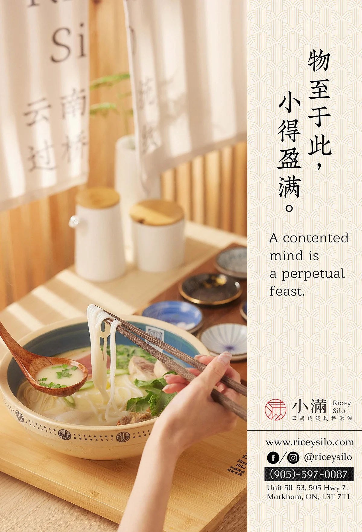
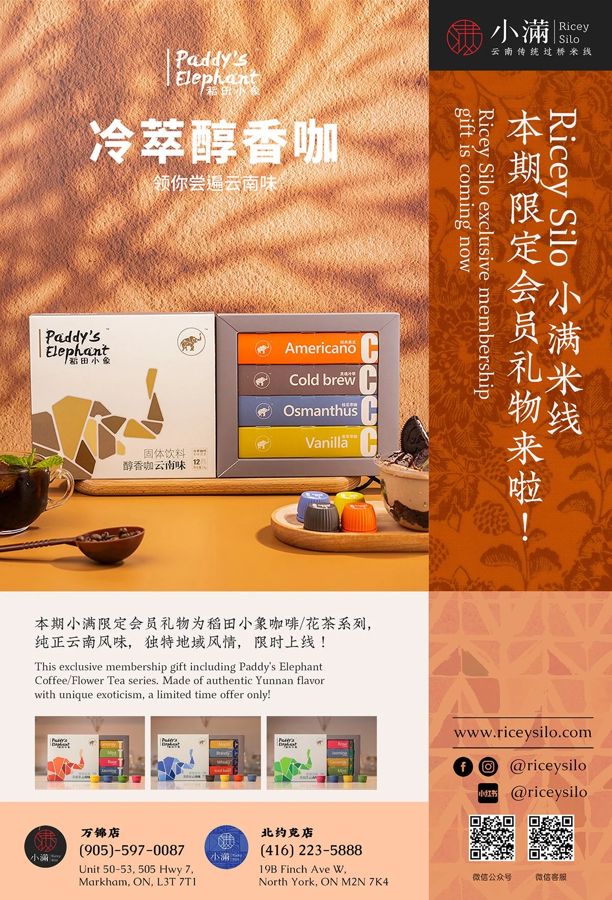


活动海报设计-Poster Design