

Chengdu Street Food 苍蝇馆子 全案设计
Comprehensive Branding


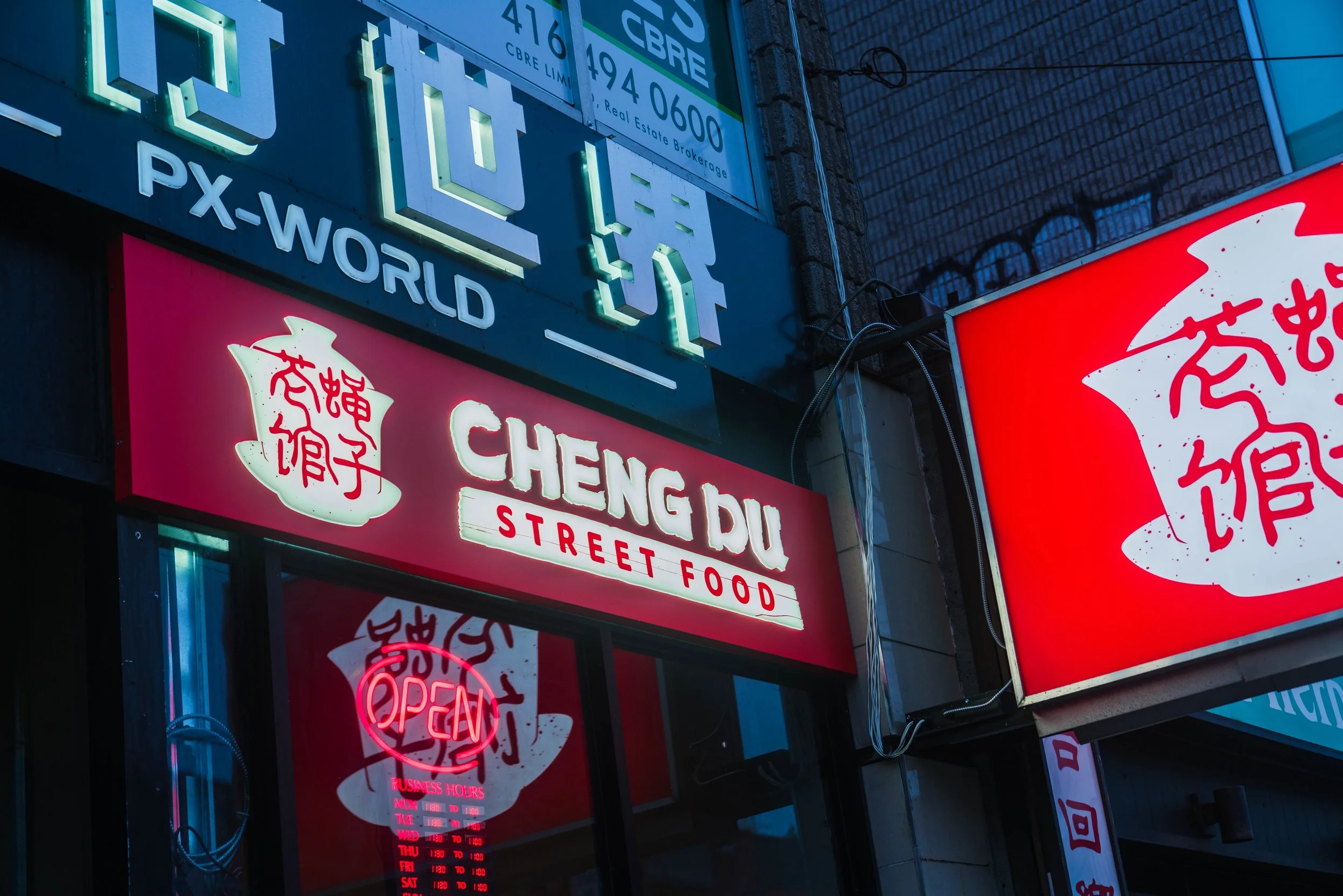
在成都,“苍蝇馆子”是一种独特的饮食文化。它们往往藏身于城市的大街小巷,店面不起眼,装修甚至有些简陋,却凭借地道的味道和实在的价格,在街坊邻里间口耳相传。比起精致的用餐环境,人们更在意的是那份熟悉的味道,以及热闹、随性、充满人情味的市井氛围。
将这样一种根植于成都本土的饮食文化带到多伦多,本身就是一件很有意思的事。对于我们而言,这个项目的挑战不仅是如何呈现地道的成都特色,更在于如何让一种看似粗粝、随意的市井文化,转化为具有审美价值与品牌辨识度的视觉语言。
In Chengdu, Fly Restaurants are small, often unassuming eateries tucked away in neighbourhood streets. Despite their modest appearances, they are loved for their authentic flavours, affordable prices, and lively atmosphere. They represent an essential part of Chengdu’s local food culture.
Bringing this unique dining culture to Toronto presented an interesting design challenge: how do we translate the raw, nostalgic charm of old Chengdu into a distinctive and thoughtfully designed brand identity?
新旧之间,寻找老成都的烟火气
Finding Beauty in the Old and Imperfect
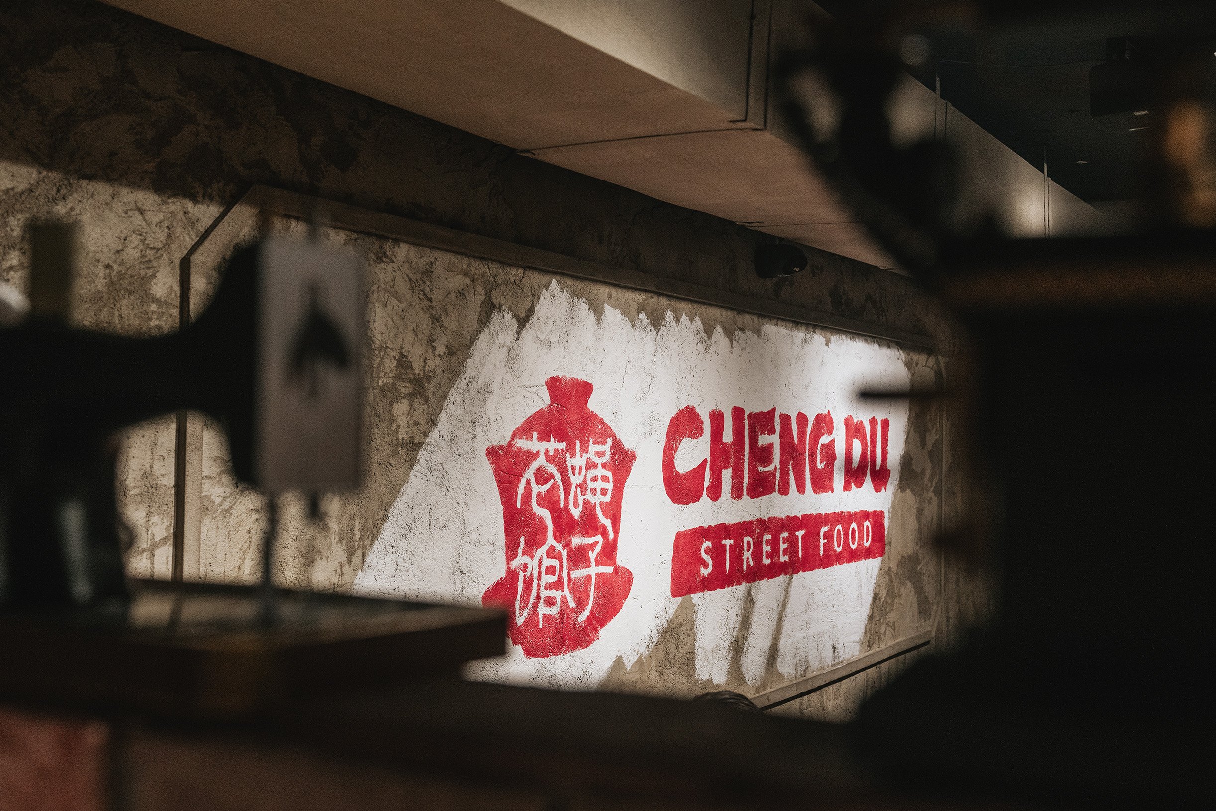
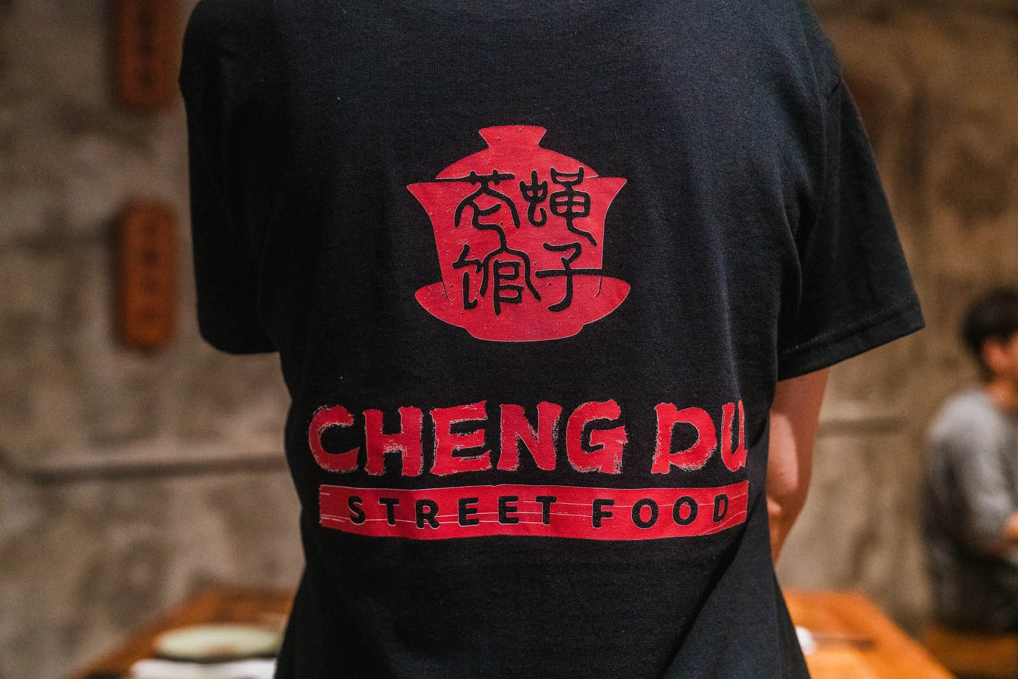
When we joined the project, the restaurant’s interior design was already taking shape. Weathered walls, distressed finishes, and vintage details created a deliberately aged, nostalgic atmosphere inspired by the streets of old Chengdu.
Rather than repeating these distressed elements in the graphic design, we took a more refined approach. Adding too many vintage textures and rough details could easily make the overall brand feel cluttered and unpolished.
Instead, we introduced a more artistic and culturally inspired visual language to balance the rustic interior. Through thoughtful typography, traditional graphic elements, and carefully selected colours, we aimed to give the nostalgic atmosphere a greater sense of depth, character, and authenticity.

在标识设计上,我们选择了成都极具代表性的盖碗茶作为核心视觉符号。
在成都人的日常生活里,一杯盖碗茶不仅仅是一种饮品,更代表着一种生活态度。午后晒着太阳,和朋友打打麻将、摆摆龙门阵,慢悠悠地喝上一杯茶,是成都街头再熟悉不过的画面。这种不紧不慢、自在随性的生活方式,也正是我们希望通过品牌传递的精神。
我们将盖碗茶的经典轮廓提炼成简洁而富有辨识度的图形,让标识既保留传统文化的记忆点,又能自然融入当代品牌设计语言,并灵活应用于招牌、菜单、包装及各类宣传物料之中。
For the logo, we drew inspiration from one of Chengdu’s most recognizable cultural symbols: the traditional Gaiwan, a lidded Chinese tea bowl.
In Chengdu, enjoying Gaiwan tea is more than a daily ritual. It represents a relaxed way of life—spending sunny afternoons with friends, playing mahjong, sharing stories, and taking time to enjoy the moment.
We simplified the iconic silhouette of the Gaiwan into a clean, memorable symbol that connects traditional culture with contemporary graphic design.
接手项目时,餐厅的室内装修风格已经基本成型。斑驳的墙面、刻意做旧的细节,以及带有年代感的装饰,共同营造出一种充满怀旧气息的老成都街头氛围。这种看似破旧的空间语言,实际上是品牌刻意营造的独特个性。
但我们也意识到,如果平面视觉继续一味强化这种做旧效果,叠加过多粗糙的纹理、破损的字体和复古元素,反而容易让整个品牌显得杂乱、廉价,失去原本希望传递的文化质感。
因此,经过反复思考与探索,我们最终选择了一条不同的设计路径:不再重复空间中的“旧”,而是以更具文艺气质与传统美感的平面设计,与室内环境形成互补。
我们希望通过相对克制的排版、富有文化韵味的图形,以及精心调配的传统色彩,让空间中的粗粝与视觉中的雅致产生有趣的对比。让品牌的怀旧不只是停留在表面的年代感,而是传递出一种更有历史底蕴、更耐人寻味的老成都气质。


在品牌配色上,我们大胆选择了红与绿作为主要视觉语言。四川有句俗语叫“红配绿,丑得哭”,但事实上,红与绿的组合在中国传统艺术、建筑与民俗文化中并不罕见。真正的挑战从来不是颜色本身,而是如何通过色彩的明度、饱和度与比例,找到恰到好处的平衡。
我们舍弃了过于鲜艳、强烈的色彩组合,转而采用更沉稳、更具年代质感的红绿配色,让两种色彩既保持鲜明的视觉个性,又能相互衬托,呈现出厚重、温暖而富有东方韵味的品牌气质。
Red and green are often considered a challenging colour combination. Yet throughout Chinese history, these colours have appeared together in traditional art, architecture, and cultural design.
The challenge was finding the right balance.
By choosing deeper, more muted shades and carefully adjusting their proportions, we created a palette that feels bold yet harmonious, bringing warmth, heritage, and a distinctly Chinese character to the brand.


