
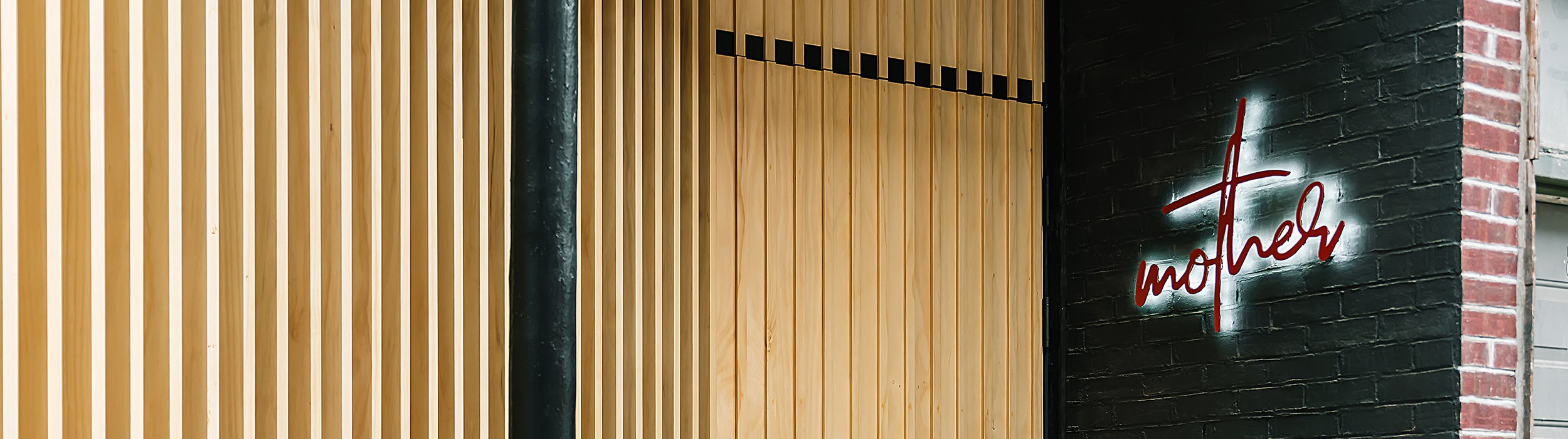
Mother Cocktail Bar 视觉设计
Menu/Posters/Social content/Photgraphy


品牌视觉背后的逻辑支撑
The Thinking Behind the Visual Identity
Mother鸡尾酒吧的理念是:精选优质天然食材,通过发酵提升其风味,为客人打造难忘的鸡尾酒体验。其店址位于纯西人区Queen street west, 受众也几乎全是西人。那么这样一个几乎没有东亚基因的品牌,在调性选择上也理应完美融合本地文化和视觉特色,不会让人觉得突兀。
Located on Toronto’s Queen Street West, Mother Cocktail Bar is known for its creative approach to mixology, using natural ingredients and fermentation to craft unique cocktail experiences.
With a predominantly local audience, we wanted to create a visual identity that felt authentic to the neighbourhood’s culture and creative energy.
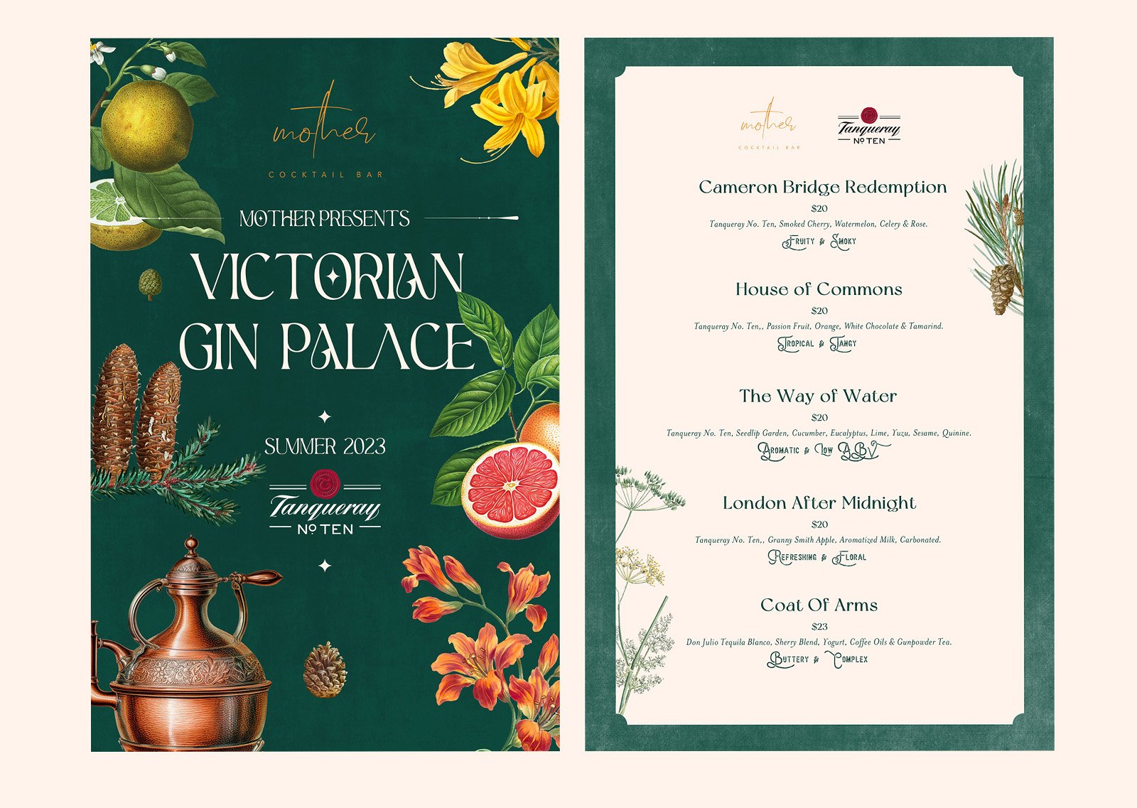
鸡尾酒吧因为其独特的行业定位,使其可以驾驭更加新锐和前卫的设计语言,而这正是我们打算要做的。和其他品牌整齐统一的风格不同,我们在这个品牌上不断加入新元素,用大胆的视觉风格不断拓展和挑战边界,让受众始终充满新鲜感和好奇感。这也和Mother在鸡尾酒设计上不断试验和创新的精神互相呼应。
Unlike brands that follow a strict and consistent visual system, Mother gave us the freedom to explore a more experimental approach. We continuously introduced new graphic elements, bold compositions, and unconventional styles to keep the brand fresh, engaging, and full of surprises.
This ever-evolving visual language reflects Mother’s own philosophy of experimentation and innovation, where creativity knows no boundaries.
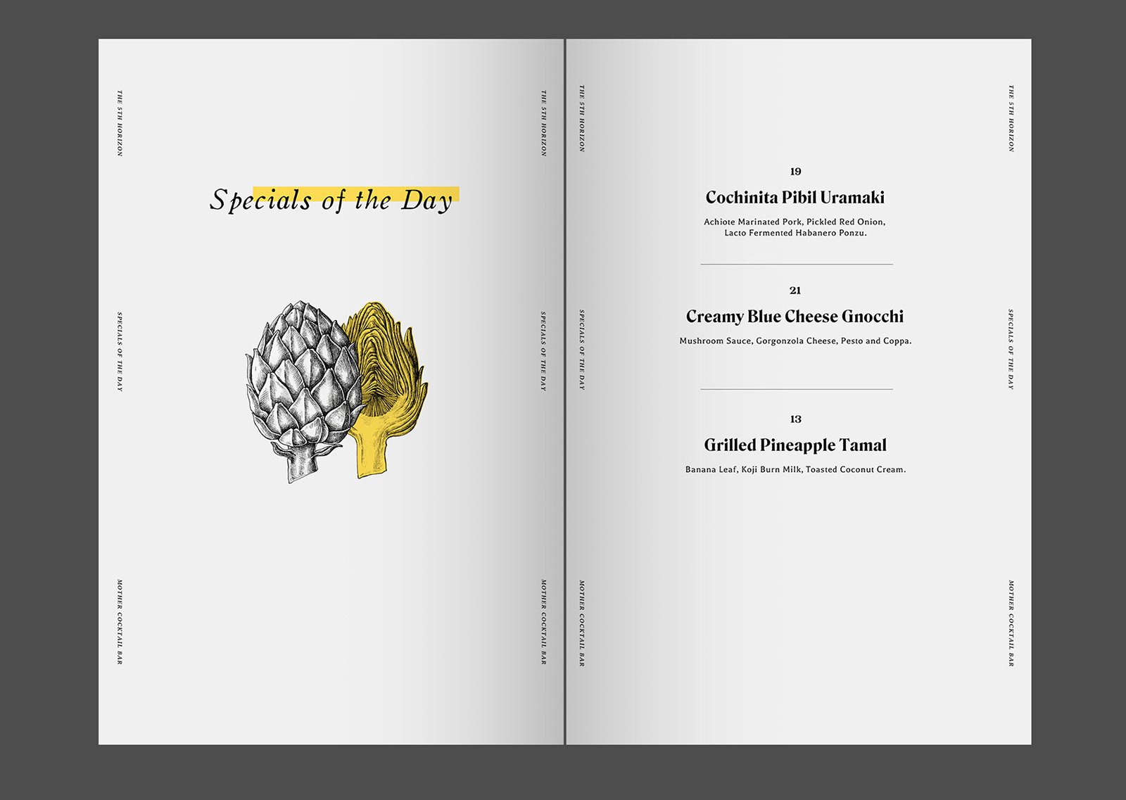

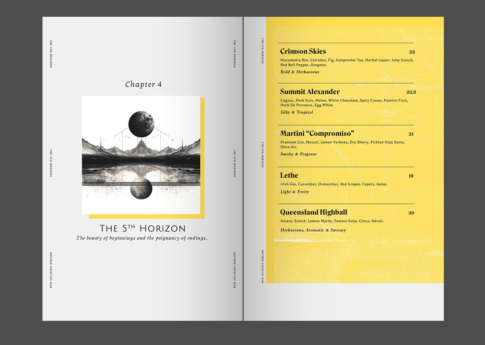


前卫,甚至带有实验性质的菜单设计- Bold, Avant-Garde, and Experimental Menu Design


海报设计-Social Post Design


创意摄影-Photography