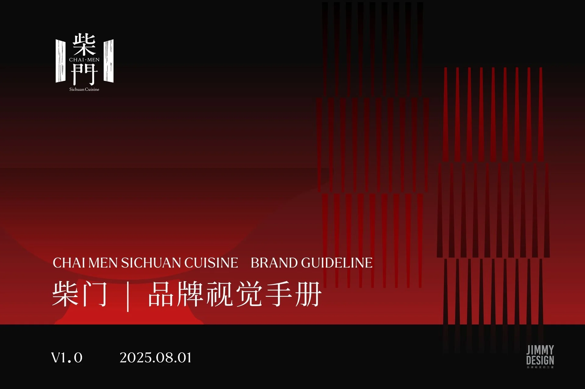
Chaimen | 柴门 全案设计
ComprehensivE Branding
一扇门,连接传统与当代东方美学
Where Tradition Meets Contemporary Elegance
柴门 CHAI MEN 是一家位于 Richmond Hill 的高端中式融合餐厅,以川菜与粤菜为核心,将不同地域的烹饪技艺与风味融入精致的现代餐饮体验。
在品牌视觉的构建上,我们希望呈现的不只是传统中餐的文化符号,更是一种兼具东方韵味与当代审美的品牌气质。
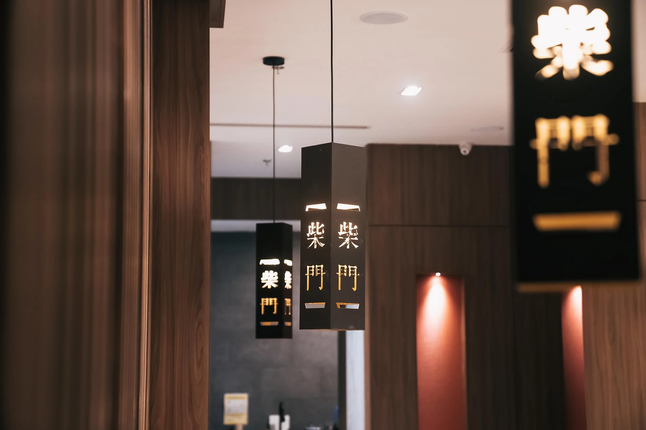
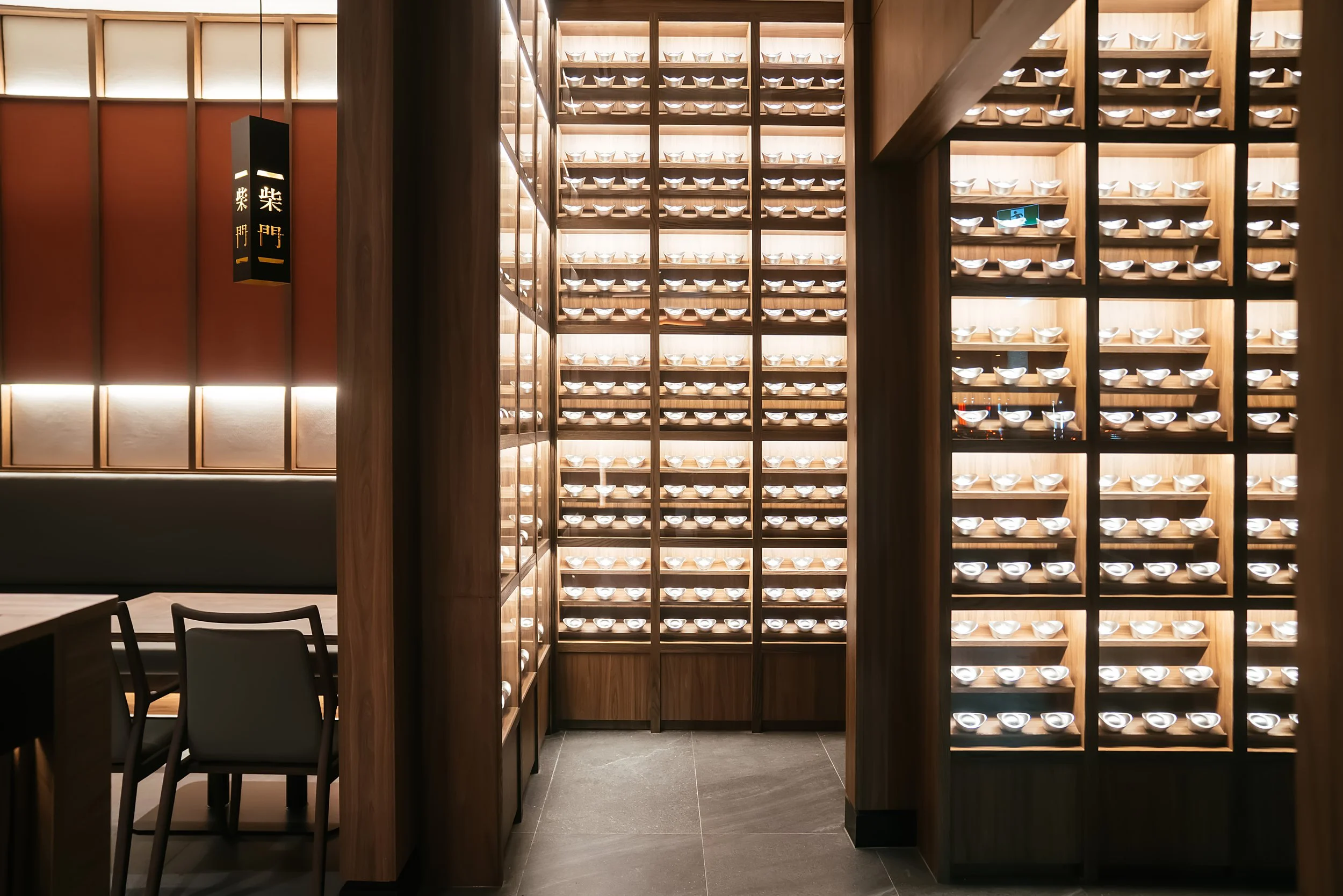
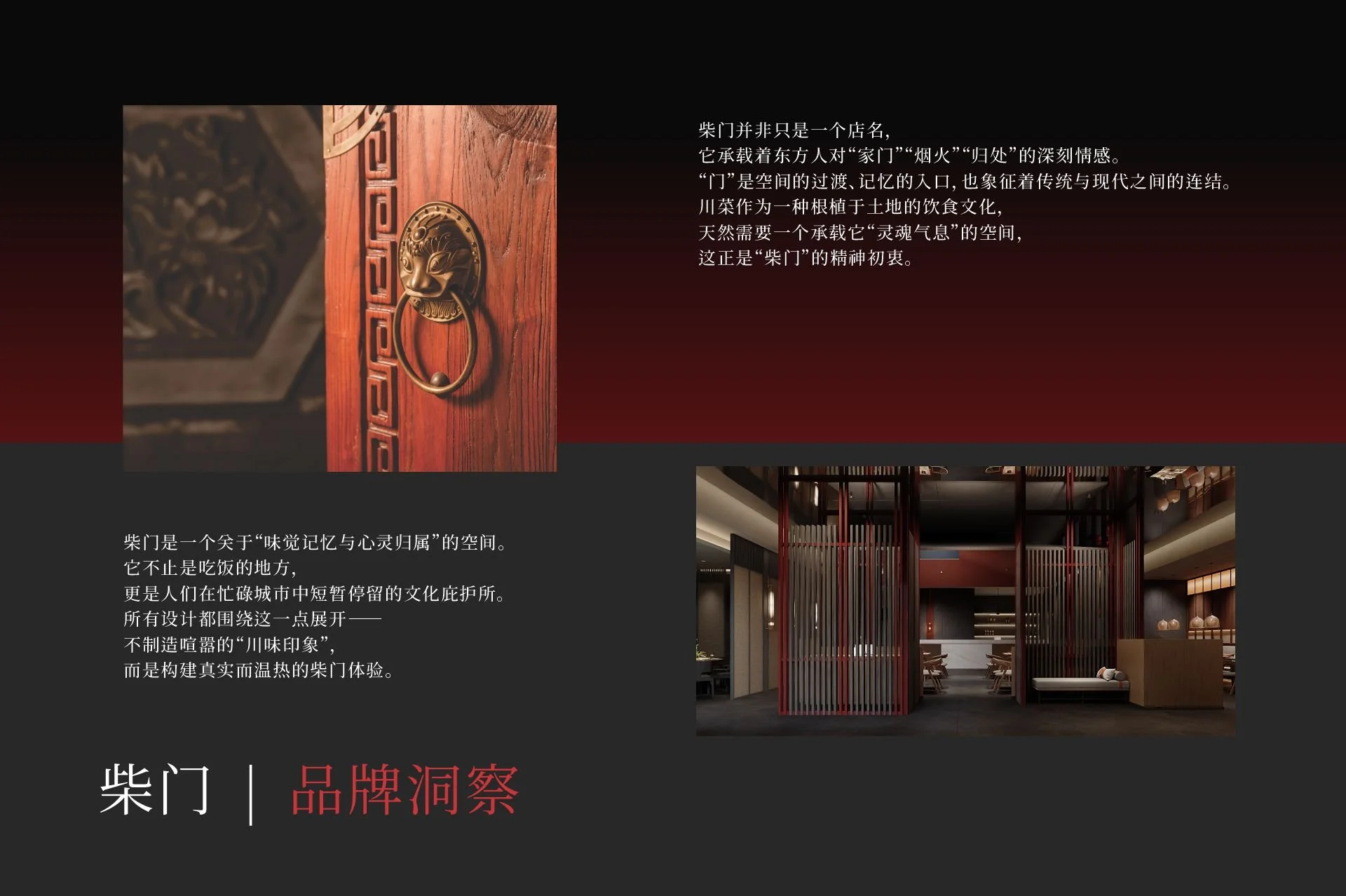
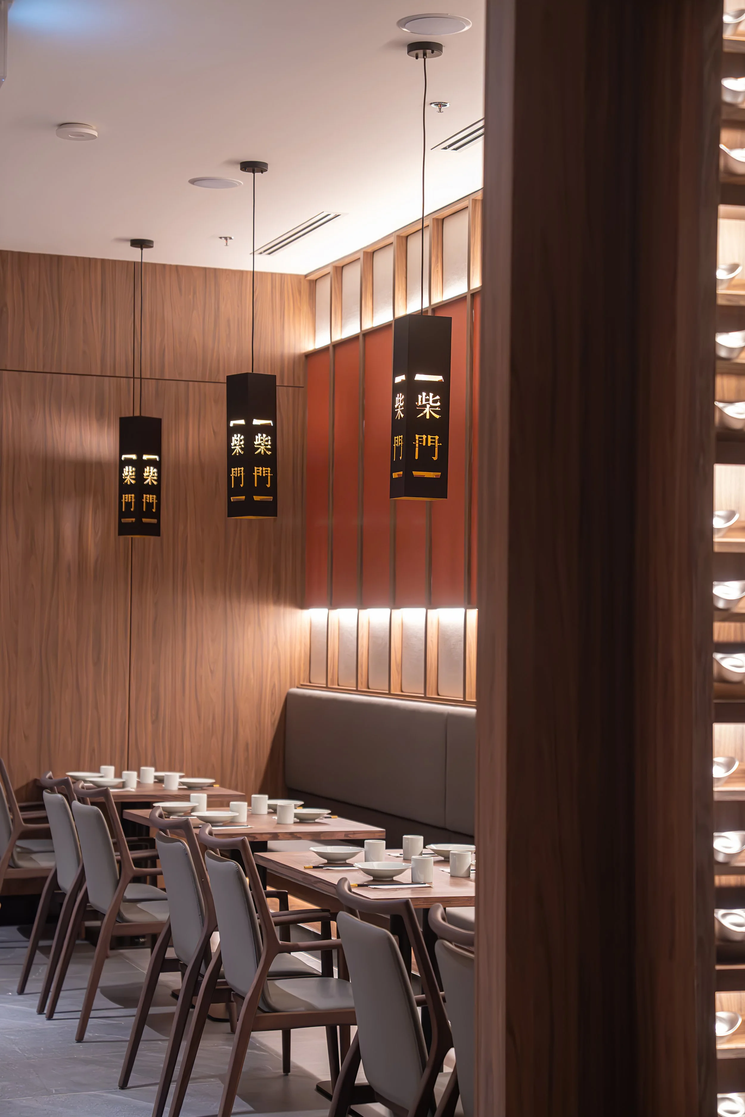
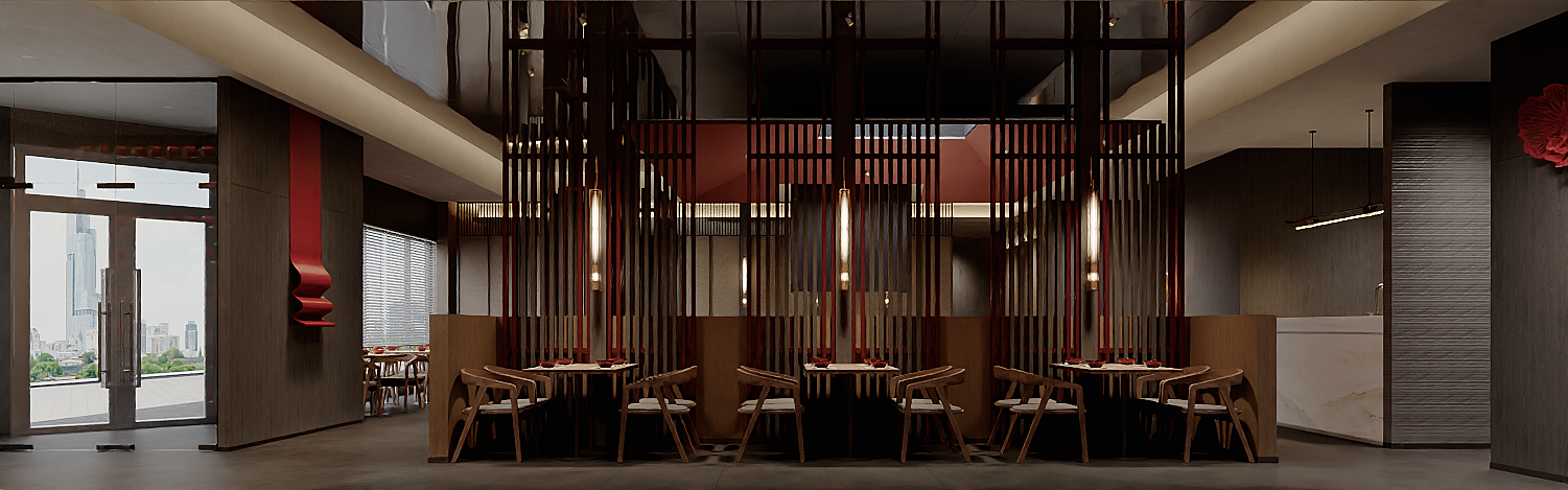
餐厅的室内空间大量采用深色木饰面,搭配黑色、朱红色与温暖的灯光,营造出沉稳、雅致且富有古韵的用餐氛围。如何让平面视觉自然融入这一空间,同时建立独立而鲜明的品牌识别,是整个设计项目的核心。
Located in Richmond Hill, CHAI MEN is an upscale Chinese fusion restaurant that brings together the bold flavours of Sichuan cuisine and the refined culinary traditions of Cantonese cooking.
Our goal was to create a visual identity that goes beyond traditional Chinese design elements, capturing the essence of Eastern aesthetics through a modern and sophisticated approach.
The restaurant's interior features rich wood textures, dark tones, deep reds, and warm lighting, creating an elegant atmosphere rooted in Chinese heritage. Our challenge was to develop a brand identity that complements this distinctive space while establishing its own visual character.
我们选择从品牌名称本身寻找灵感,让“门”成为贯穿整个视觉系统的核心元素。
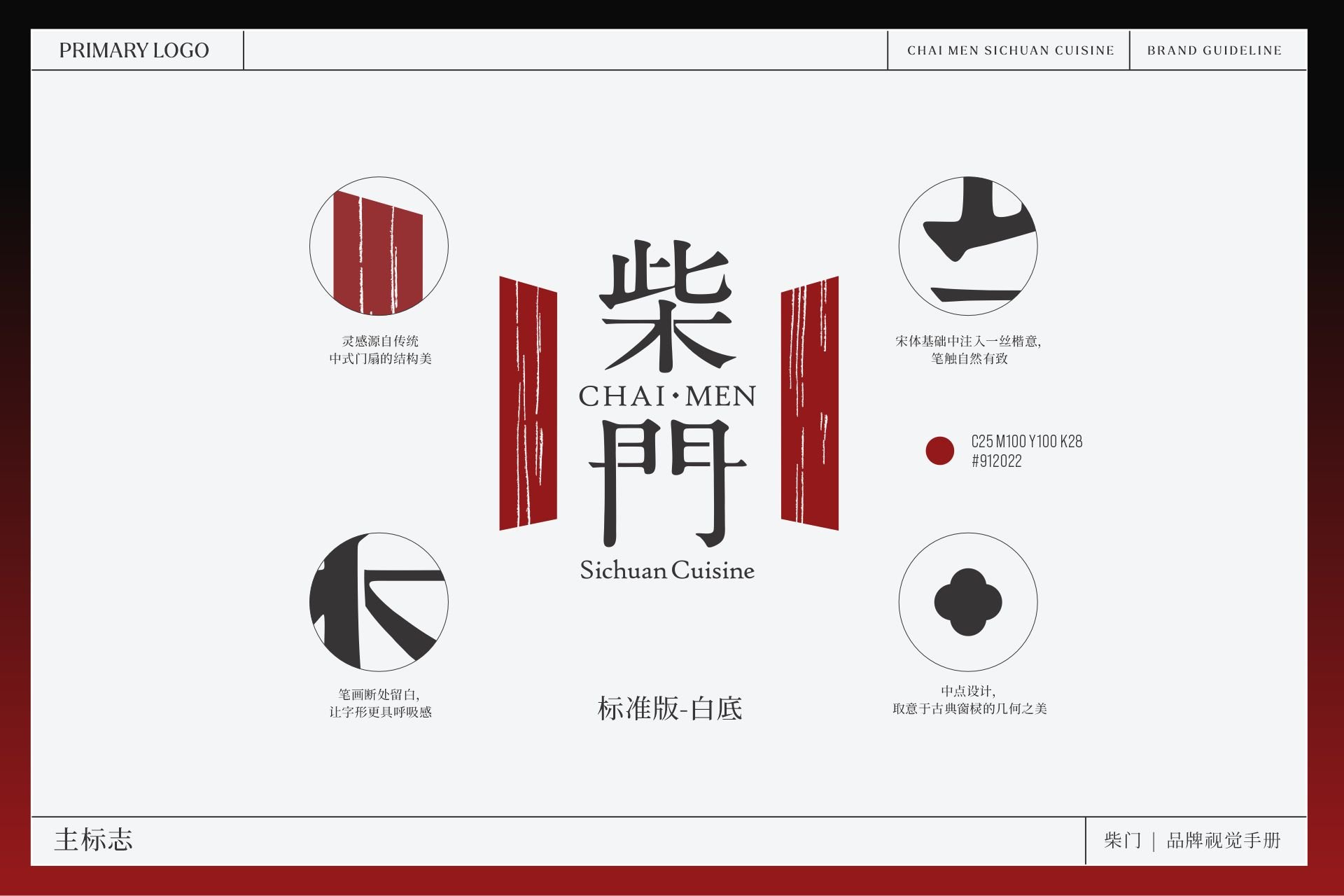
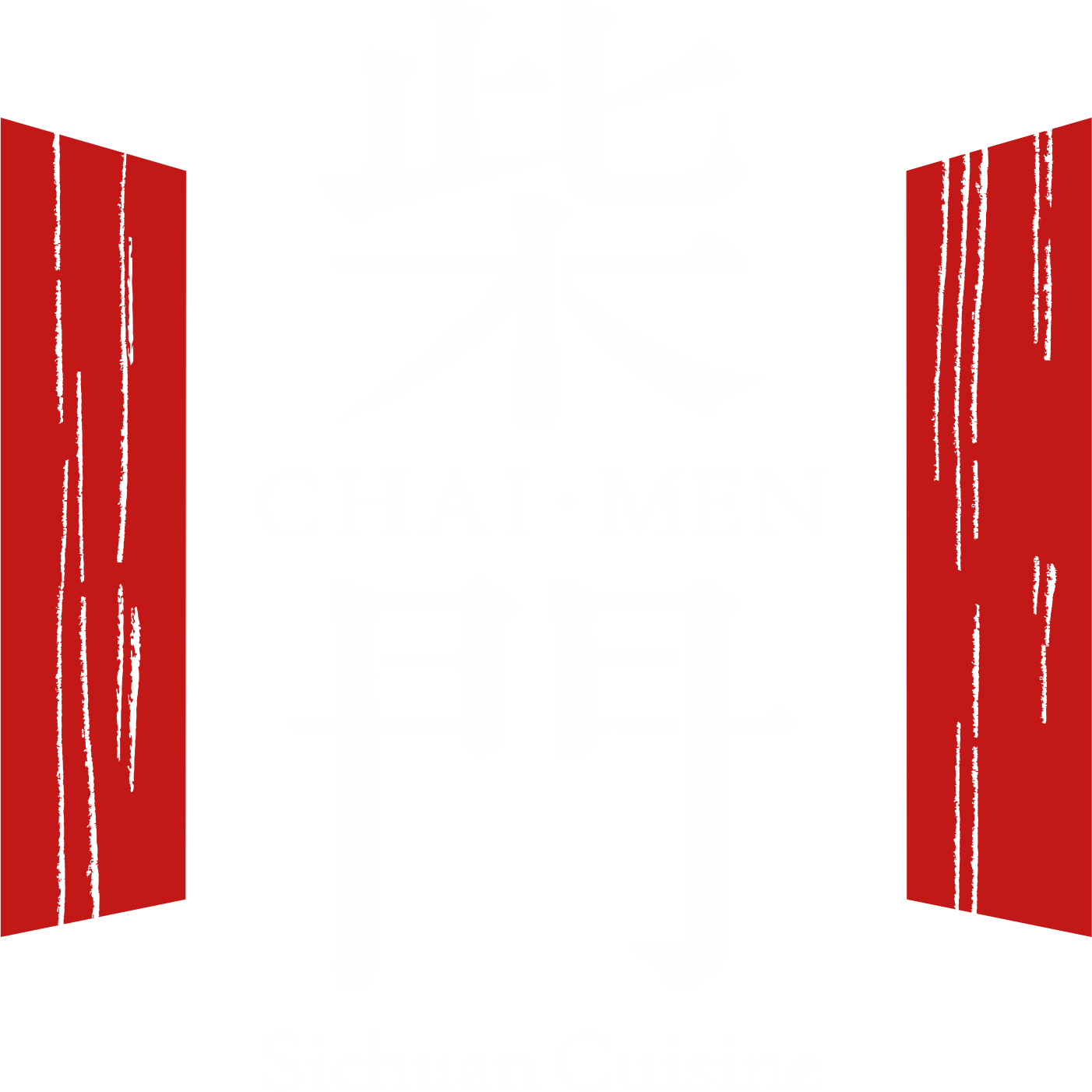
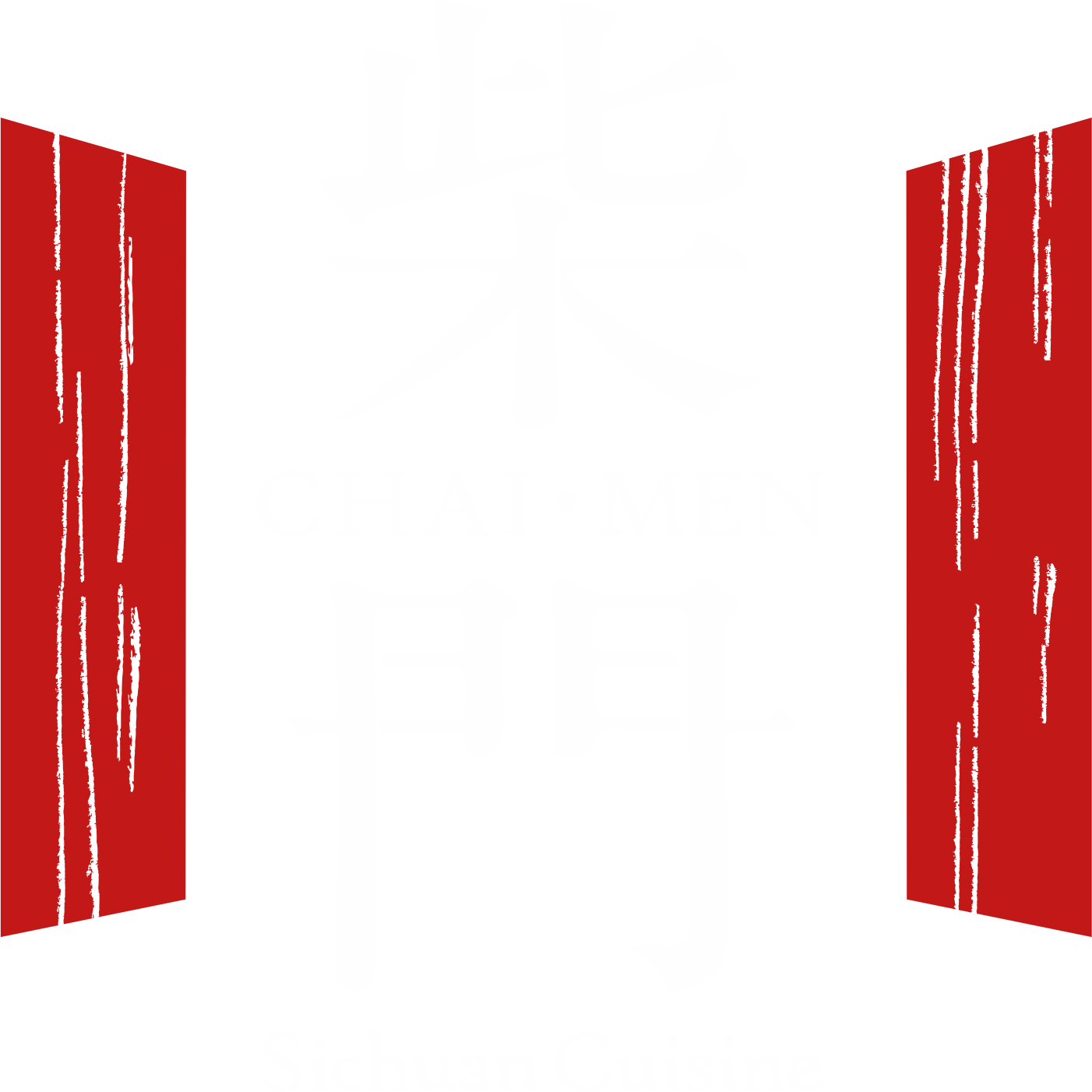
在 LOGO 设计中,我们以传统中式门扇的结构为灵感,将两侧朱红色的几何图形与富有书法韵味的“柴门”二字结合。文字笔画在保留传统书写美感的同时,经过适度的简化与调整,让标识在古典与现代之间取得平衡。整个图形如同一扇缓缓开启的门,既呼应品牌名称,也象征着一场精致中式餐饮体验的开始。
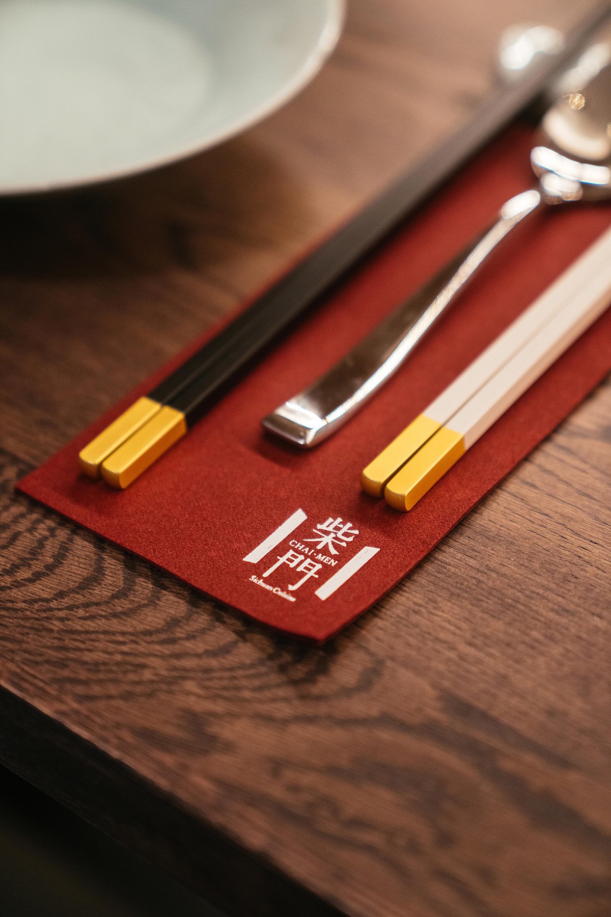
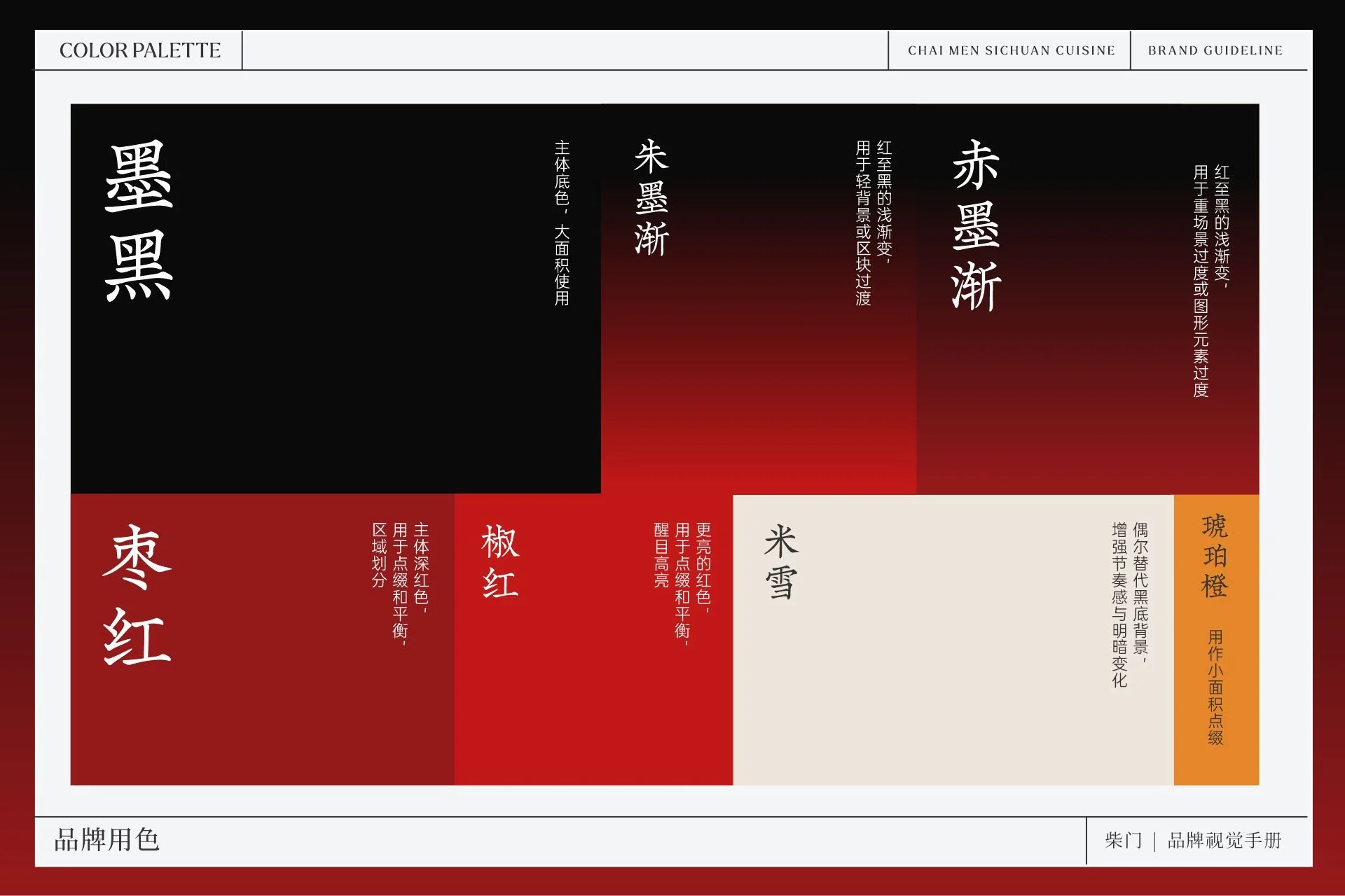
在色彩系统上,我们以深邃的墨黑作为视觉基础,搭配富有层次的深红、朱红与少量暖橙色。黑色传递沉稳与品质感,红色则承载着中式文化特有的热情与仪式感。通过控制不同色彩的比例与明暗变化,让整体视觉既具有鲜明的识别度,又保持高级、克制的东方气质。
字体与版式设计同样延续这一理念。我们将富有古典韵味的中文字体与现代排版方式结合,利用留白、文字层级与细腻的图形元素,让传统文化不再只是装饰,而是成为整个品牌视觉语言的一部分。
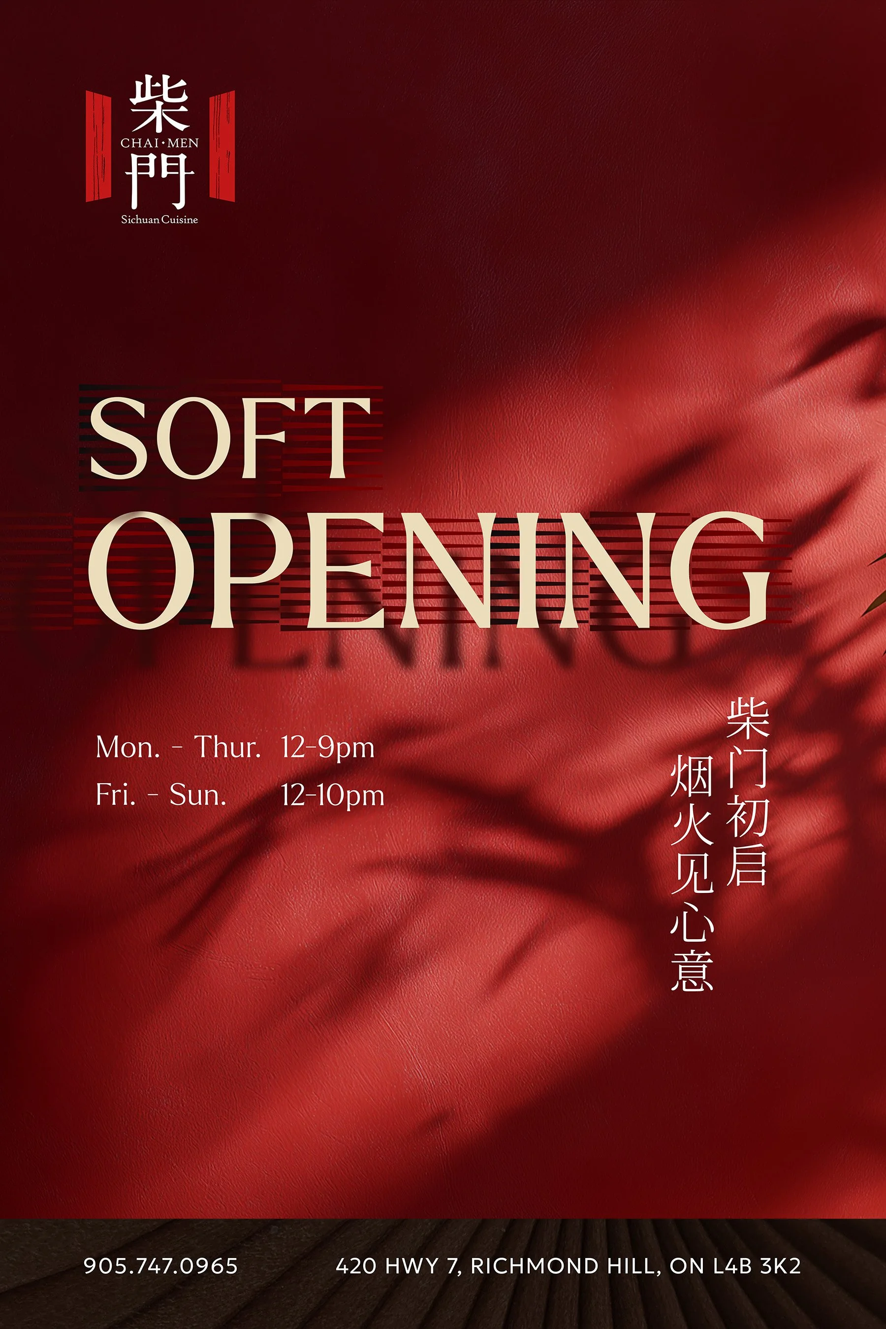
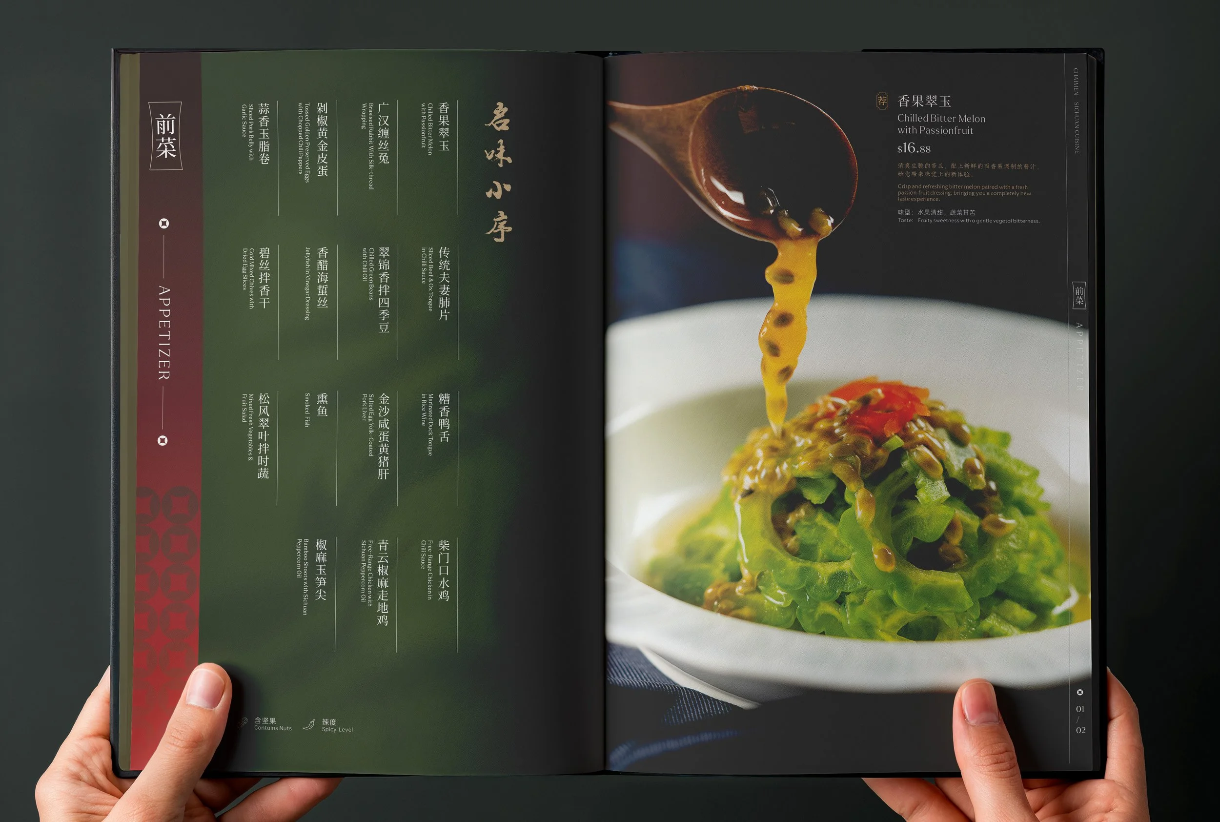
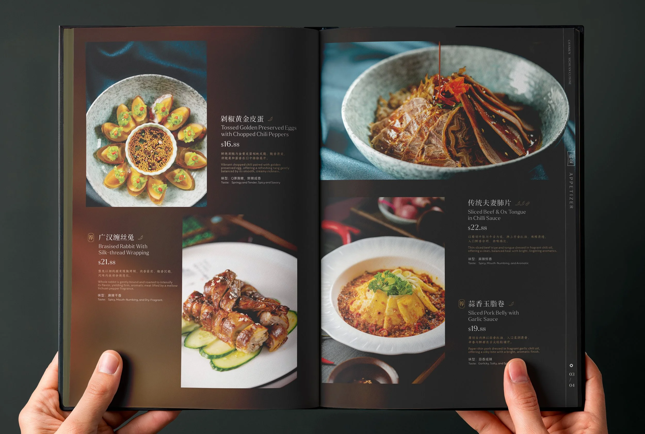
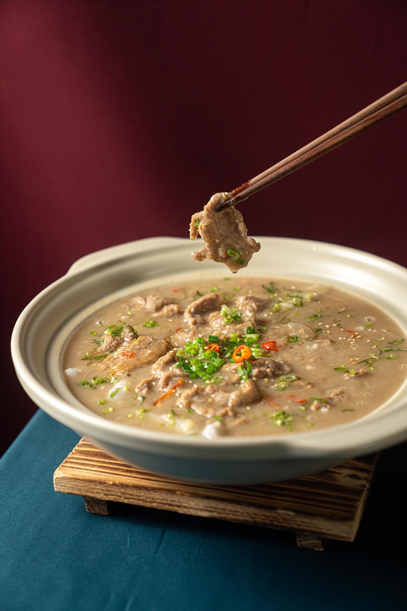
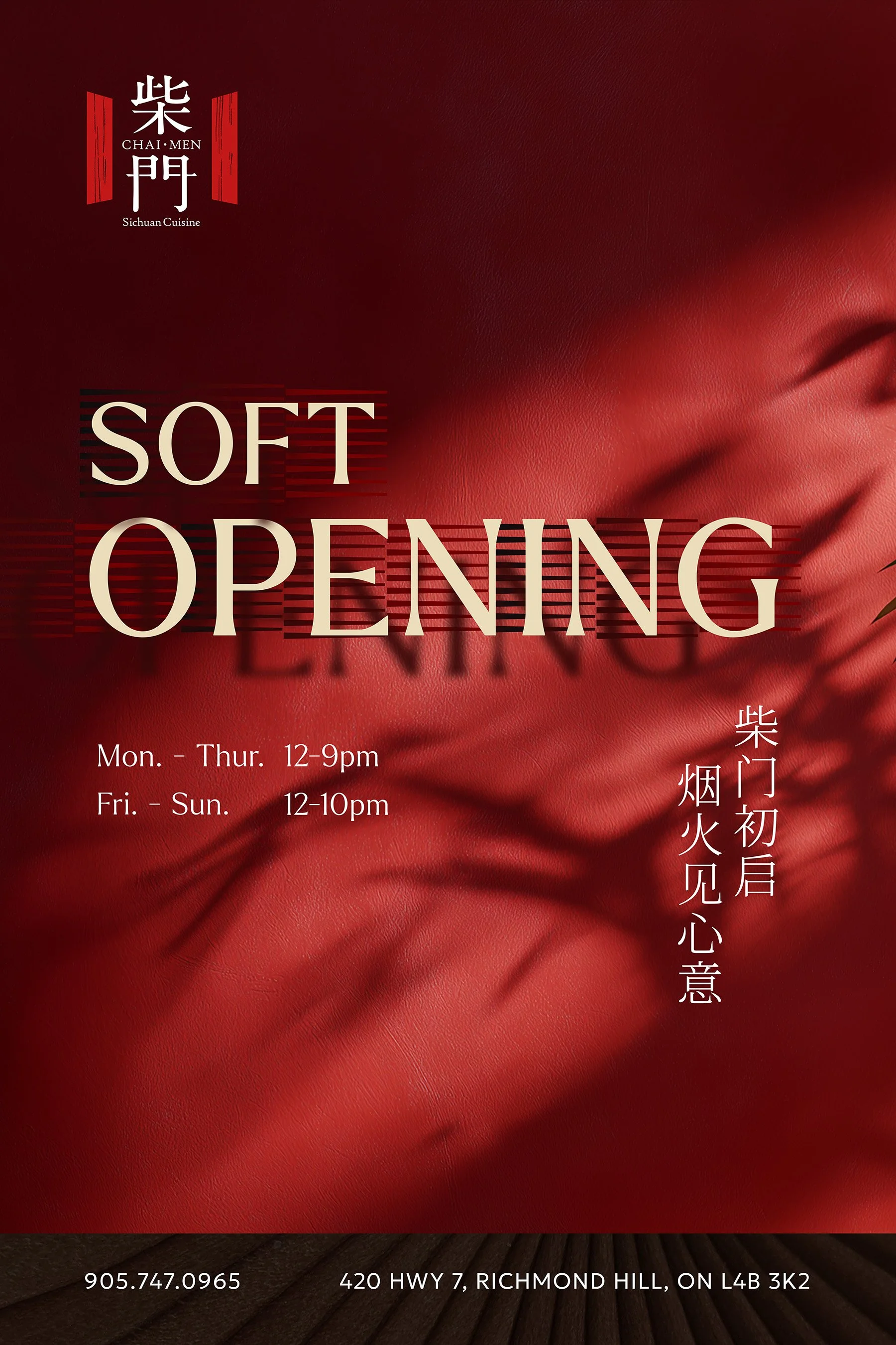
从品牌标识、视觉手册到菜单、开业海报及营销物料,我们建立了一套统一而富有延展性的视觉系统。既能够呈现传统中式料理的文化底蕴,也能满足高端餐饮品牌在当代市场中的传播需求。
We found our inspiration in the brand's name itself, making the traditional Chinese doorway the central element of the visual identity.
For the logo, we combined two bold red geometric forms inspired by traditional Chinese doors with custom Chinese typography. The characters retain the beauty of traditional calligraphy while embracing a cleaner, more contemporary structure. Together, they form a memorable symbol that reflects the brand's name and welcomes guests into a unique dining experience.
The colour palette is built around deep black, rich burgundy, vibrant red, and subtle touches of warm orange. Black brings sophistication and depth, while red introduces warmth, energy, and a strong connection to Chinese culture. Carefully balanced proportions and subtle gradients create a visual language that feels bold yet refined.
Typography and layout follow the same philosophy. By combining traditional Chinese-inspired letterforms with contemporary compositions, thoughtful spacing, and subtle graphic details, we created a design system that feels both timeless and modern.
From the logo and brand guidelines to menus, promotional campaigns, and in-store graphics, every element works together to establish a cohesive and distinctive brand experience.