米食堂 Kome Shokudo 全案设计
Comprehensive Branding

品牌视觉背后的逻辑支撑
The Thinking Behind the Visual Identity
米食堂 Kome Shokudo 是一家位于 Richmond Hill 的日式丼饭专门店,以物美价廉的日式简餐为定位,凭借招牌牛肉丼和丰富的日式料理选择,吸引了众多喜爱日本美食的顾客。
我们始终认为,优秀的品牌设计并不意味着一味追求高端,而是找到最适合品牌定位与目标受众的视觉表达。 设计不仅需要美感,更需要服务于品牌的商业目标,让消费者在第一眼就能感受到品牌的个性与价值。
Kome Shokudo is a Japanese donburi restaurant located in Richmond Hill, known for its affordable, quality meals and signature beef bowls.
We believe great design isn't always about looking premium. It's about finding the right visual approach for the brand, its audience, and its business goals.
基于米食堂亲民、快捷、注重品质的品牌定位,我们希望打造一套既有鲜明辨识度,又不失日式美学特色的视觉系统。整体以明快的黄色与沉稳的黑色作为品牌主色调。黄色充满活力,能够迅速吸引目光、激发食欲,同时传递轻松、友好的用餐氛围;黑色则为品牌注入简洁、克制的视觉质感,在活泼与精致之间取得平衡。
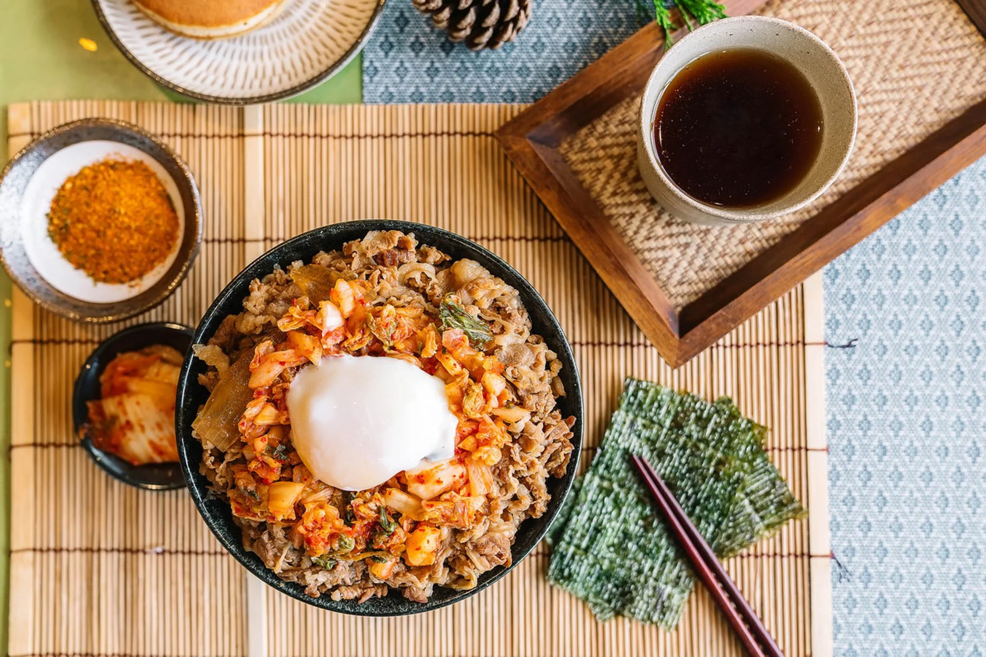
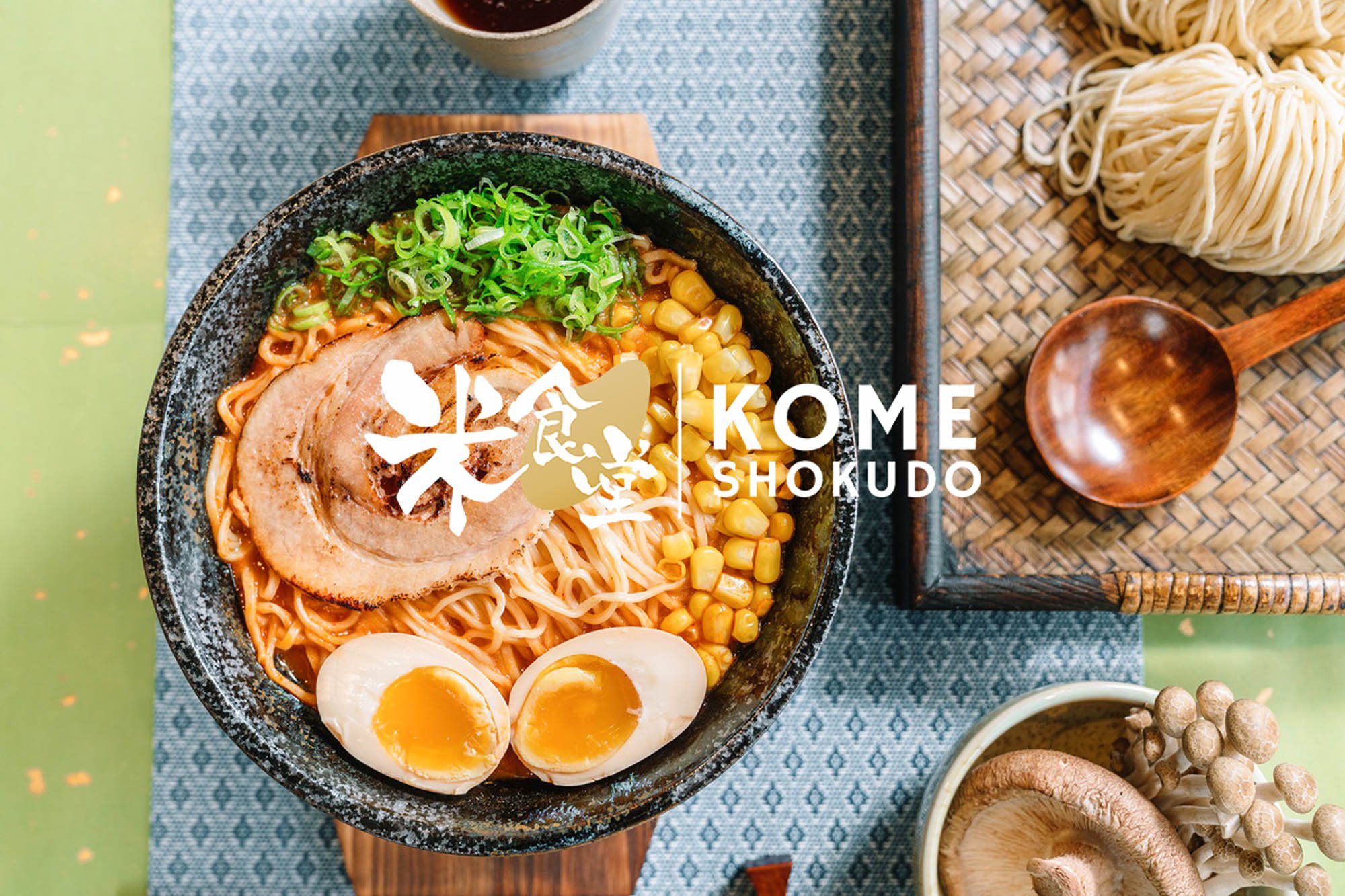
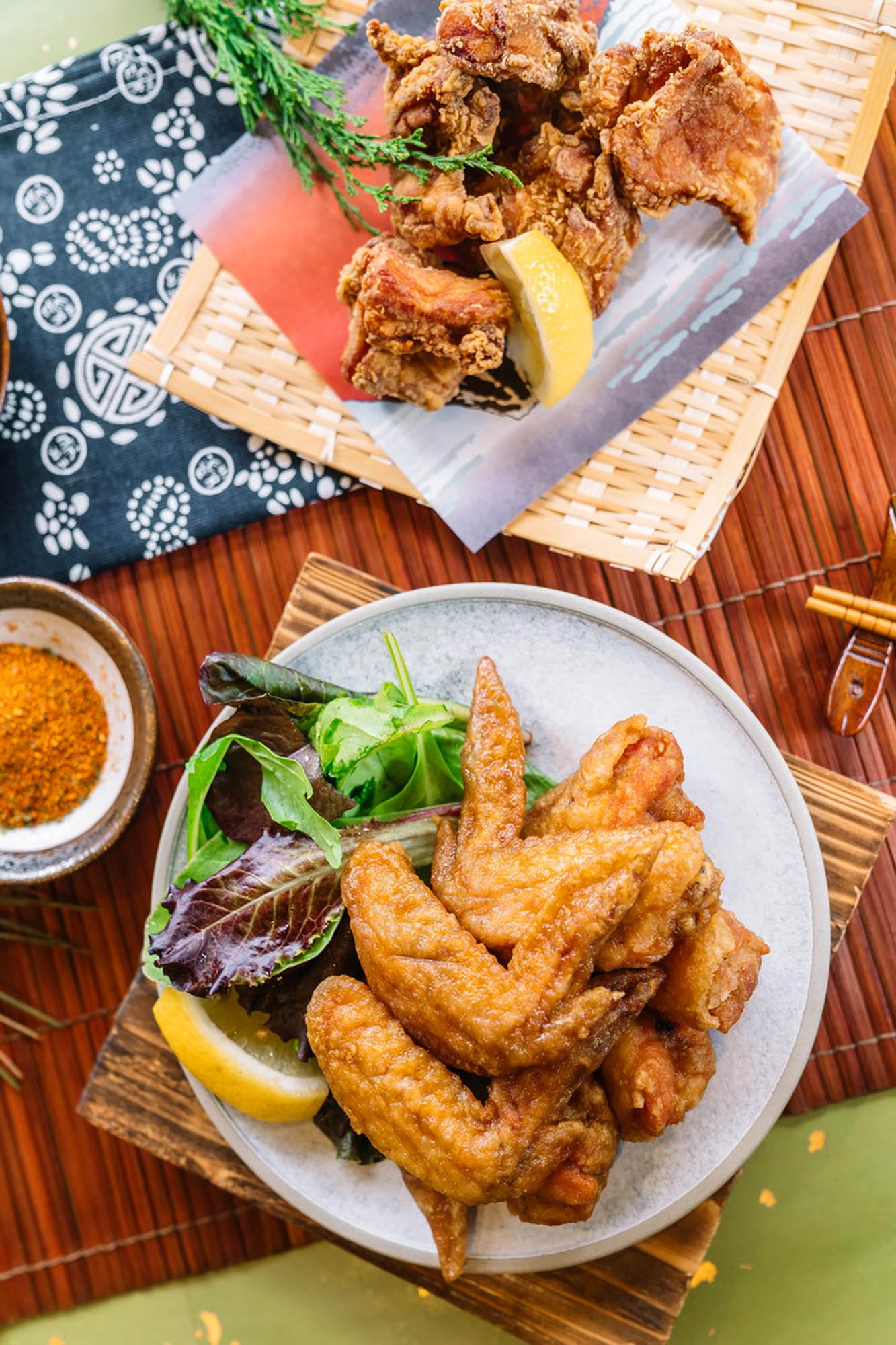
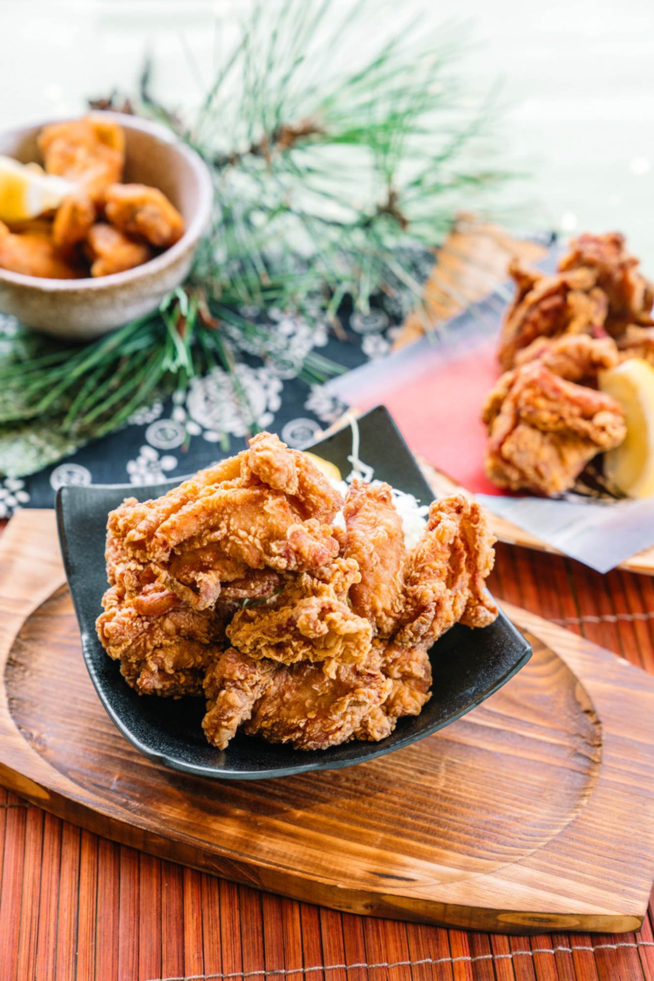
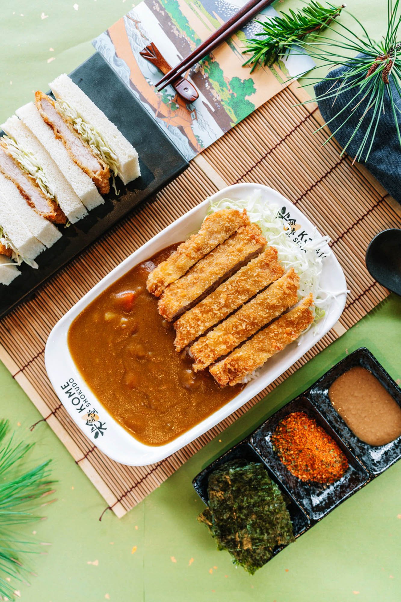
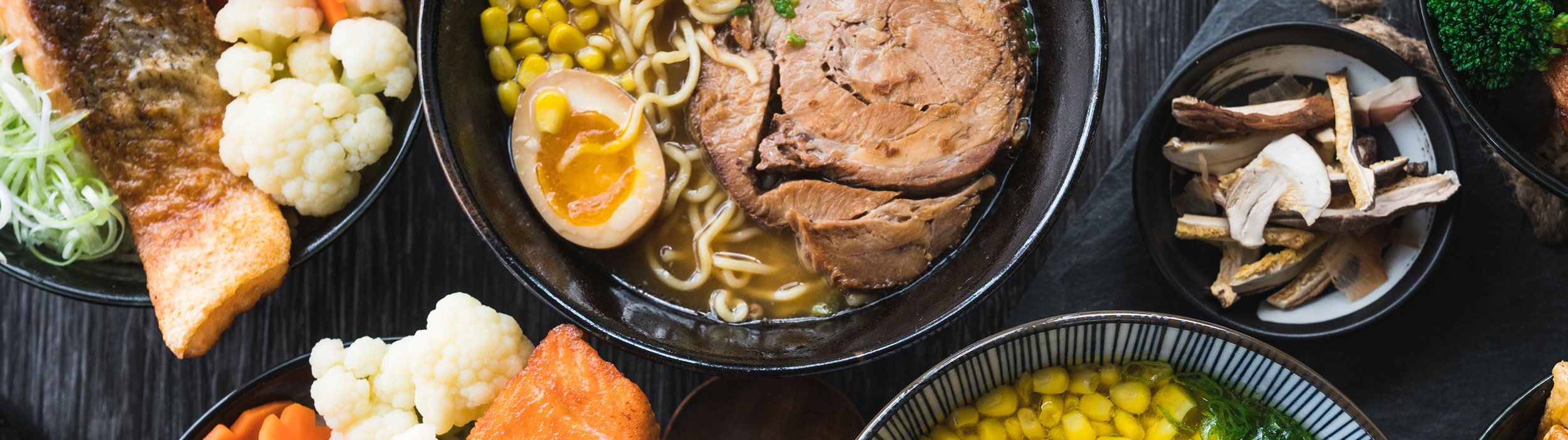
在具体的视觉应用中,我们通过大胆的色块对比、清晰直接的字体排版,以及富有食欲感的美食摄影,建立统一而灵活的品牌语言。从店内菜单、宣传海报到各种营销物料,设计始终围绕一个核心展开:让信息更容易被理解,让美食更有吸引力,让品牌更容易被记住。
不刻意追求高级感,也不因亲民定位而牺牲设计品质。米食堂的视觉设计,是一次在商业需求、品牌个性与审美表达之间寻找平衡的实践。
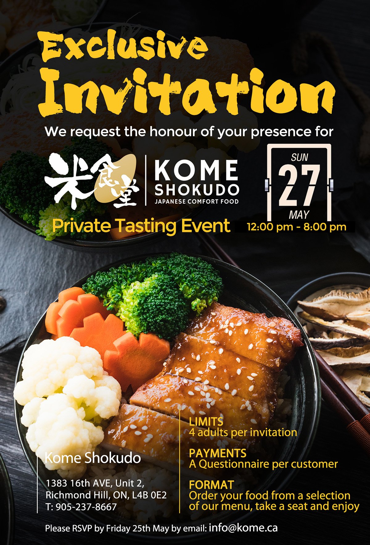
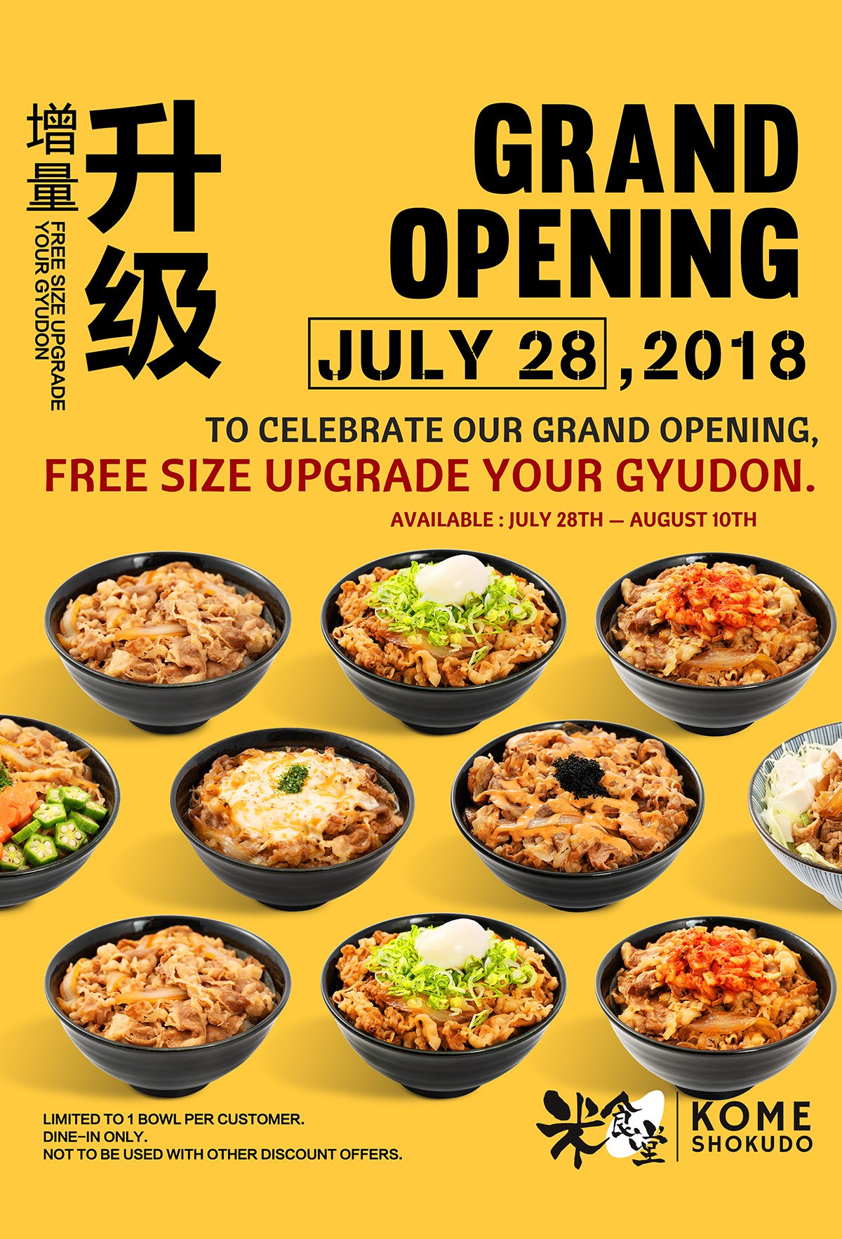
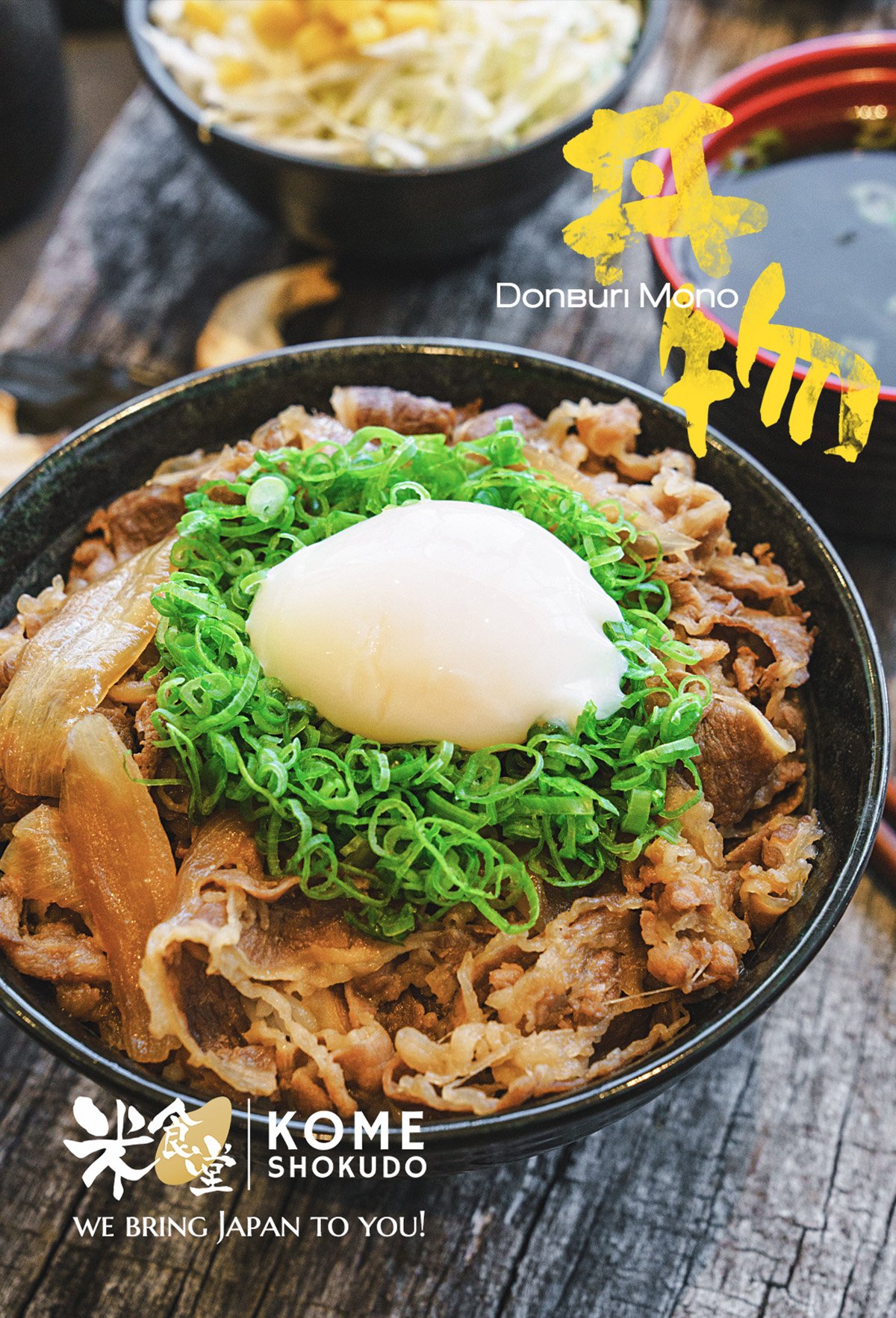
亲民但不廉价的视觉设计-Poster Design
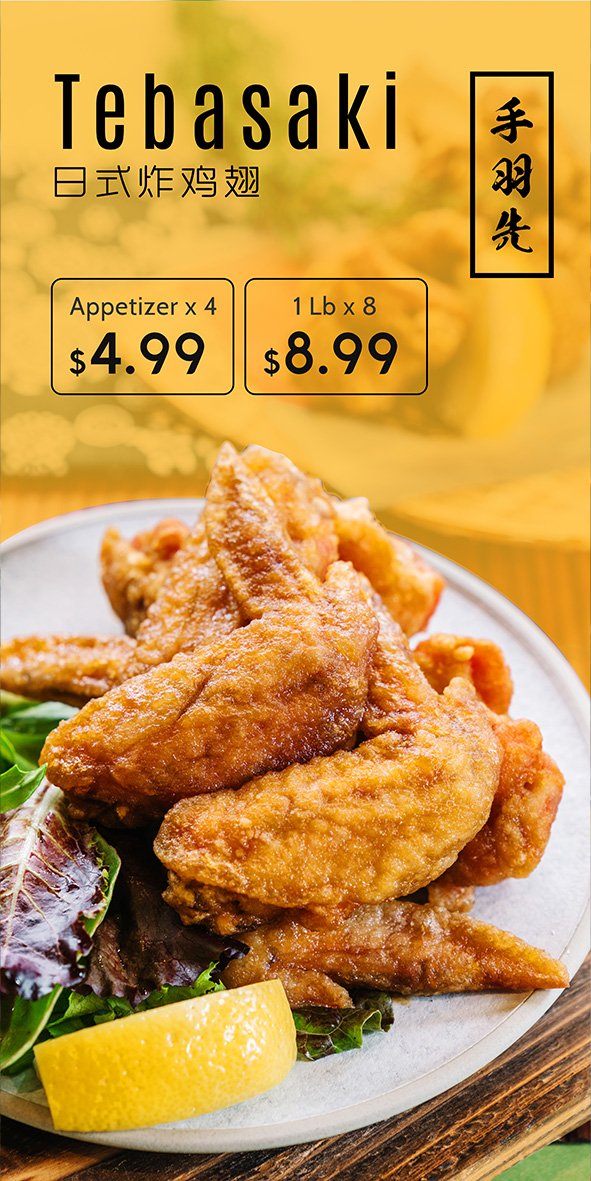
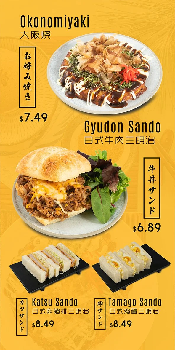
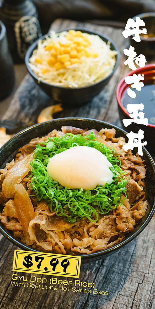
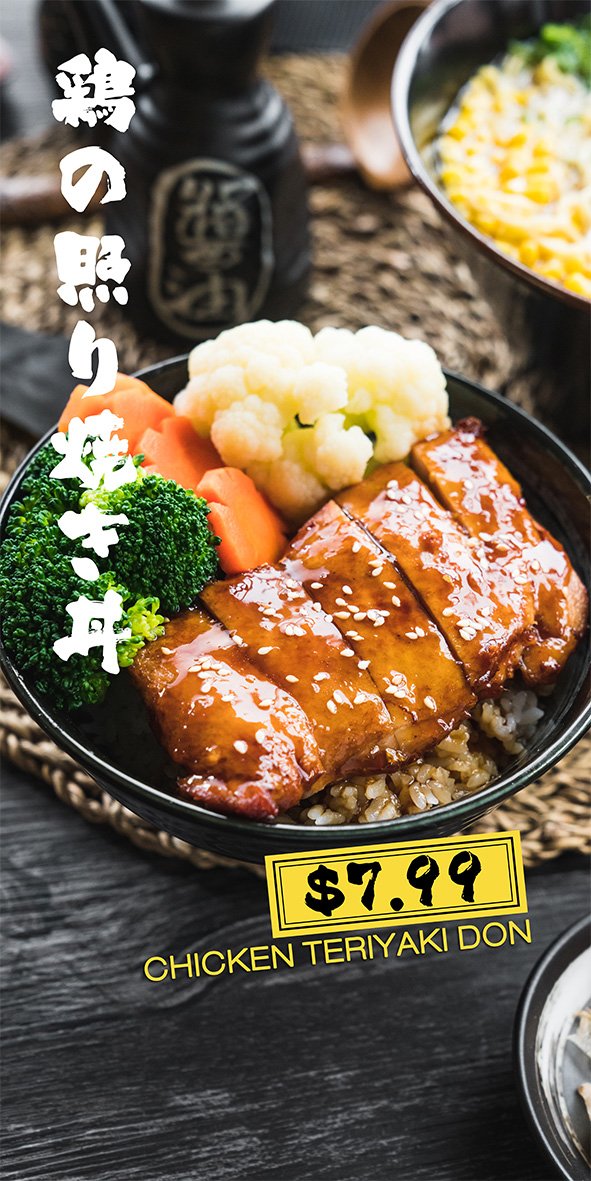
For Kome Shokudo, our goal was to create an approachable yet distinctive brand identity that balances affordability with Japanese-inspired aesthetics.
We chose vibrant yellow and bold black as the primary brand colours. Yellow brings energy, warmth, and appetite appeal, while black adds a sense of simplicity and refinement. Together, they create a strong visual contrast that feels both playful and polished.
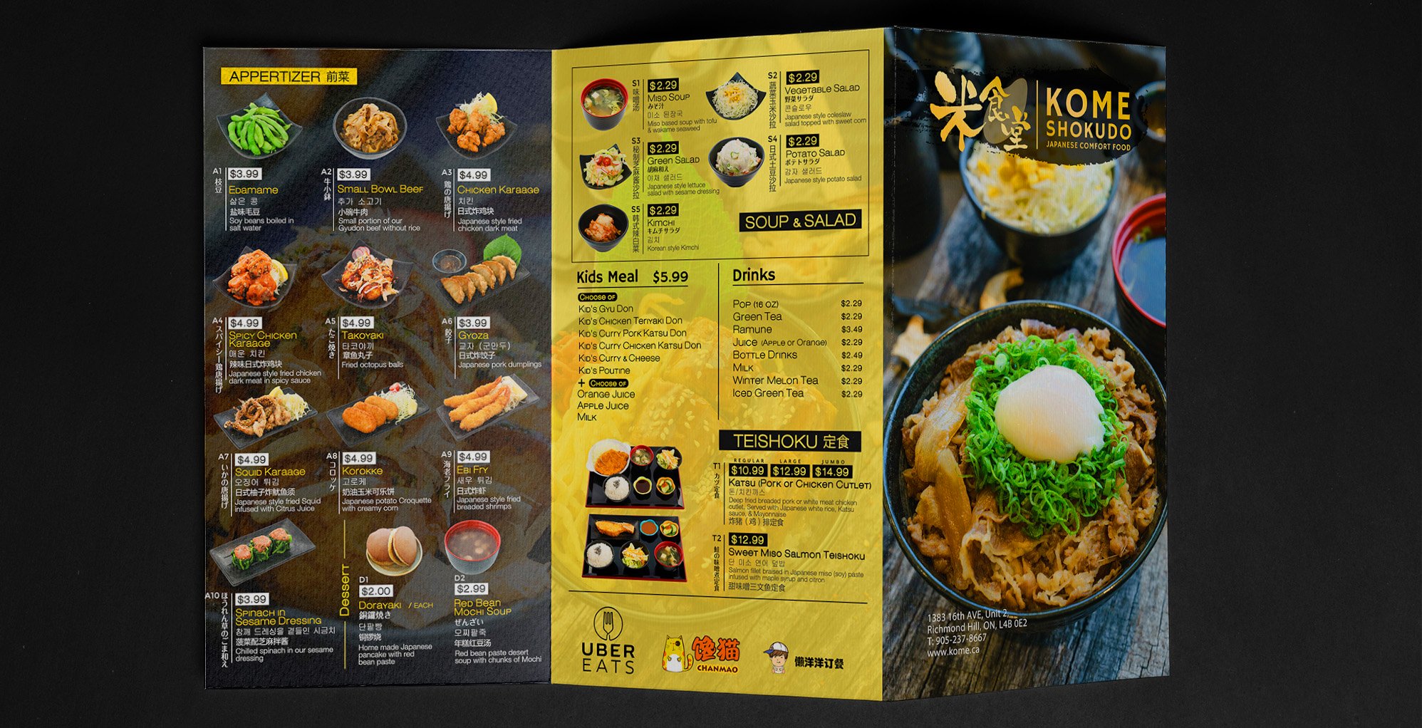
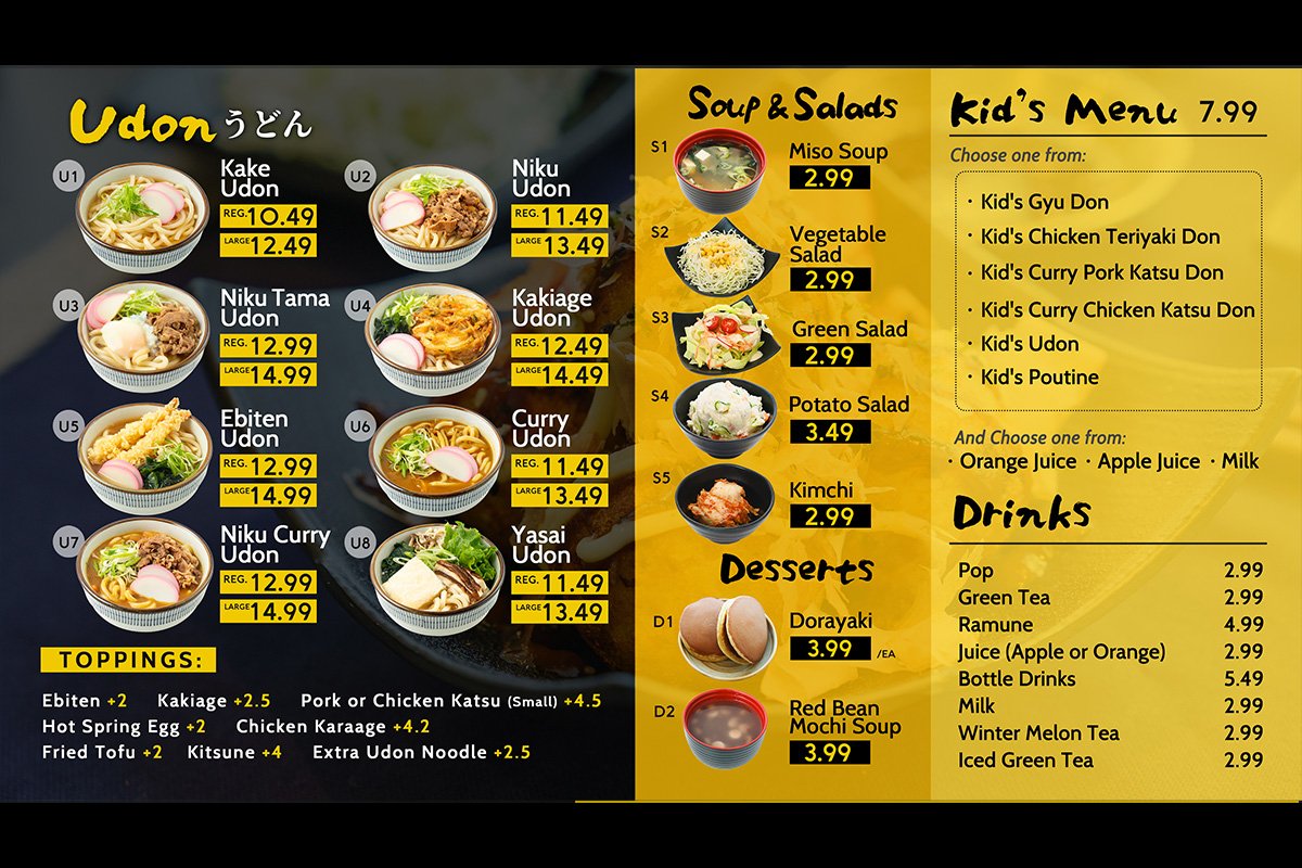
Through bold colour blocking, clean typography, and appetizing food photography, we developed a cohesive visual language across menus, promotional materials, and in-store graphics. Every element was designed to communicate clearly, highlight the food, and make the brand instantly recognizable.
The result is a visual identity that strikes the right balance between personality, accessibility, and thoughtful design—proving that great branding doesn't have to feel luxurious to be effective.
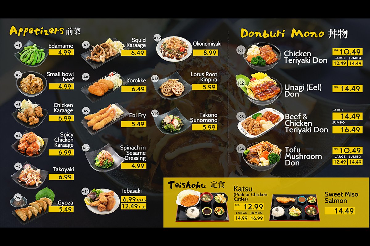
清晰且醒目的菜单设计-Menu Design